

There are a couple designer secrets that aren’t often shared when it comes to choosing brand fonts.
The first: Steer clear of using your logo font throughout the rest of your brand (unless it’s a secondary font that you’ve used for your tagline). This makes the logo distinct and keeps it from getting lost among other text on your website and collateral items.
The second: Give each brand font a “job.” Choose one font for your headers, one font for your body text, and maybe one other accent font (maybe). This streamlines your brand by creating consistency.
But even after learning these secrets, you might still have some questions about brand fonts.
How do you go about finding, choosing and pairing fonts that will accurately represent your business and appeal to the right customers?
I’ve got you covered.

Finding the right fonts
One great way to differentiate your brand from competitors, create distinction and increase memorability is by creating a strong visual brand.
Elements like color, iconography and photos help your brand stand apart, but type is also a great tool for differentiation.
You might find a simple header font or body font in the options included on your computer, but you’ll often need to look elsewhere to find some more distinct options.
Here are a few of my favorite font resources.
1 | Adobe TypeKit is a subscription font service that’s often included in Adobe Creative Cloud.

It features thousands of fonts from established foundries and houses them in one library that’s easy to browse (I especially love the classification menu to easily sort through different types of fonts).
The fonts included in Adobe TypeKit are high-quality and classic, and I refer to Adobe TypeKit first before browsing any of the other options below.
If you already subscribe to Adobe Creative Cloud, check to see if TypeKit is included in your subscription. If not, you can take a look at the different subscription options here.
2 | MyFonts.com is a font website that features both classic and trendy fonts.

I usually visit MyFonts when I’m in need of a distinct font for a logo or a bold header option, and MyFonts makes it easy for me to preview the text I’m using before purchasing (which is super helpful, because most of the fonts on their website aren’t free).

I can also sort through the different font options by tags and save favorites to my account, just in case I need to refer back to them later.
3 | FontSquirrel is a font website that houses thousands of high-quality, free (and legal) fonts from around the Internet (which means it’s especially helpful for creative business owners on a budget).

Like TypeKit and MyFonts, FontSquirrel allows you to search by different font categories and take your fonts for a “test drive” before downloading them.

FontSquirrel fonts are entirely free, and you can start downloading them by visiting the website here.
4 | Typewolf has a great resource page on their website with all kinds of helpful tools for finding fonts and learning more about typography.

Their list includes learning resources like ebooks and glossaries, websites for purchasing and hosting fonts, foundries and type designers, typography blogs and forums, inspiration and more.
I highly recommend taking a look at it here.
Choosing the right fonts
It’s difficult to find the right fonts if you don’t understand what types of fonts you should be looking for. And that’s where a little bit of typography wisdom comes in.
There are many, many font categories out there, but for the sake of this overview I’m only going to focus on 4 of the most basic classifications that will come in handy when you’re trying to choose fonts that accurately represent your brand.
1 | Serif - Serif fonts have little lines attached to the ends of each letterform (some people call them “feet”). They tend to look more classic, traditional and serious.
Serif fonts are generally easier to read in long print passages, which is why you often see them used for novels and longer publications.
2 | Sans serif - Sans serif fonts don’t have those extra lines on the ends of each letterform. In fact, sans serif actually means, “without serif.” They tend to look more modern.
Sans serif fonts are generally easier to read on screens because they aren’t as “noisy” as serif fonts, which is why you often see them used for web.
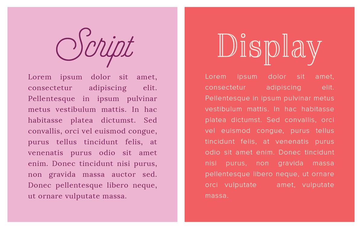
3 | Script - Script fonts generally have connected letters and resemble cursive lettering/calligraphy. Script fonts come in many different styles from hand-lettered and fun to elegant and traditional.
4 | Display - Display/decorative/novelty fonts are meant to attract attention. They’re usually more eye-catching than practical and for that reason, they’re best used in small doses.

Pairing the right fonts
Like any art form, typography doesn’t have any absolute rules that have to be followed. But it is helpful to understand and use some best practices when you’re pairing brand fonts in order to end up with a result that’s visually pleasing.
The best rule-of-thumb when pairing brand fonts? Contrast, contrast, contrast.
The key to pairing fonts is creating contrast, whether it’s through mixing up font categories, font weights or font sizes.
The differences in font categories, weights and sizes don’t have to be over the top, but it they do need to be noticeable.
Contrasting font categories
The most commonly used combination of fonts is serif and sans serif (a serif header and a sans serif body font, or a sans serif header and a serif body font).

But you can follow the same rule with script fonts and serifs and display fonts and sans serifs.
Since script fonts and display fonts are very distinct, it’s usually best to refrain from pairing the two together (because remember, both of them should only be used in small doses).
Instead, consider pairing them with less decorative options from the serif and sans serif font categories.
Contrasting font sizes and weights
Different font sizes and weights can also be used to create contrast.
You might use fonts within the same category for your headers and your body text, but you can still achieve contrast by varying your font sizes and weights.

In all of the examples above, the header text is much larger and bolder than the body text, which helps differentiate it and guide your eye to the header first.
You can apply these same contrast rules (category, weight, size) to the fonts you include in your logo, too.

Finding, choosing and pairing fonts for your brand doesn’t have to be difficult.
All you need is a helpful font site (like TypeKit, MyFonts, or FontSquirrel), a basic understanding of font categories and some contrast.
And remember those two tips I mentioned at the outset:
- Steer clear of using your logo font throughout the rest of your brand (unless it’s a secondary font that you’ve used for your tagline).
- And give each brand font a “job.”
Which fonts have you chosen for your brand? What is the “job” or role of each one?


