Design is all about communication. While every graphic designer strives to make their work visually pleasing, creating pretty things shouldn't be the only goal. Even more important is effectively communicating the right message to a viewer, and as designers we have several tricks up our sleeve to do just that.
One of those 'tricks' is hierarchy. This tool helps us call attention to the things we want you to look at first and bring less attention to the things we want you to look at last. You may not realize it, but each time you look at a website or a menu, your brain ranks the elements of the page in order of importance based on visual cues. Those rankings guide your eye around a page.
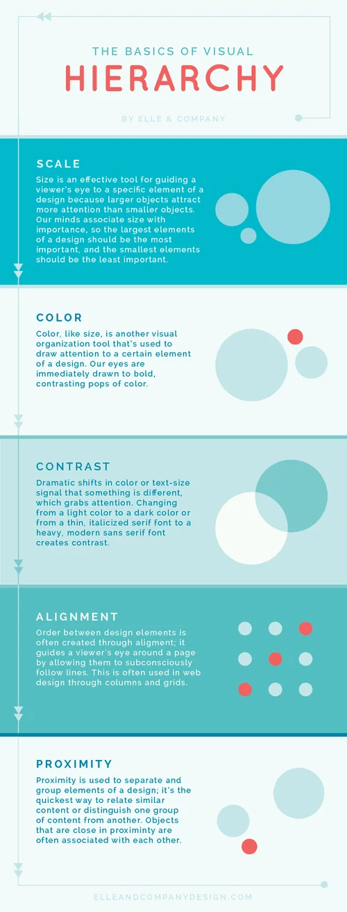
There are a 5 basic design principles that we use to help us achieve proper hierarchy: scale, color, contrast, alignment, and proximity.
How hierarchy relates to you
For those of you who are bloggers and/or business owners, you're bound to come across items that require design, especially your website. Knowing these principles and being aware of how to use hierarchy to your advantage can make a large difference in your audience's user experience and how they navigate your site.
When used properly, hierarchy can greatly benefit your website (as well as any other design materials) and make your blog/business appear professional. But hierarchy can also be used incorrectly. Too many websites have poor hierarchy; there aren't any clear distinctions in size, alignment, or proximity, and viewers have a hard time knowing which item to look at first. The size of their blog titles competes with the size of their logo, they use too many competing colors that don't allow for contrast, and they fail to create distinct groups of information through proximity and size. You can prevent this confusion by following the principles listed above and running a handy little hierarchy test.
How to test the hierarchy of your website
The easiest way to test your hierarchy is to do a user test. Ask someone who is unfamiliar with your website to sit down and tell you which elements they see first, second, third, etc. when they land on your page. I recommend running this test with several people to gain as much feedback as possible. Their input will give you insight on which items are calling too much attention to themselves and which items need more attention. Then you can go back and make adjustments to your page using the 5 hierarchy principles listed above.
While you may not consider yourself a designer, you are fully capable of learning and using tricks of the trade to effectively communicate the right message to your audience. Becoming more aware of hierarchy and it's role in guiding a viewer around a page on a website or a page in a magazine can only benefit the items that you design for your blog/business in the future.


