
With every client branding project, I make it my mission to not only create a distinct visual identity for each business but to develop a system for how all of the design elements work together.
Not only does it make for a more polished, professional brand in the long-run, but it makes it much easier to implement a brand into my client's website and collateral items like business cards, social media images, product packaging, etc.
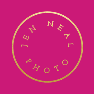
Jen Neal's new brand goes down as one of my favorite design projects because of the system we created with her vibrant colors, bold patterns, and classic typography. I'm excited to share the design process with you and offer a behind-the-scenes look at how I strategically incorporated each design element into her brand.

Step 1 | Research
I start each design project by giving my clients a series of in-depth questionnaires about their brand, workflow, and website, but I also ask them to pull together visual inspiration in a Pinterest board. I'm always interested to see which colors my clients are drawn to and determine if they would be a good fit for attracting their ideal audience. Sometimes it's spot on, other times it needs a few tweaks and adjustments.
Jen's was spot on.
She identified her ideal clients as "newly engaged couples in the 20-30 age range with middle to upper class income. More specifically, couples that want to have fun with their photog, have interesting stories to tell and are not afraid to play by their own rules."
She also used these 10 adjectives to describe her brand: Vibrant, sharp, modern, happy, beautiful, classic, confident, friendly, real, fun.
The second I landed on her Pinterest board, I saw some really great potential. These colors were a perfect balance of vibrant, modern, and classic.

Step 2 | Inspiration
I combed through the board looking for similarities, saved the strongest images that aligned with her 10 adjectives, and compiled them into an inspiration board.

The fuchsia adds vibrancy to the board, the gold adds a classic element into the mix, the florals soften it up a little and give it that beautiful touch, the navy is confident and a great dark neutral, and the clean lines and texture are modern and fun.
This inspiration board serves 2 large purposes in my design process.
First, it ensures that Jen and I are on the same page with the visual direction of her brand before I dive into logo concepts. Without it, I end up doing a lot more revisions in the later stages of the process. By developing an aesthetic and color palette at the outset, it saves a lot of time in the long-run and keeps us on schedule.
Second, it gives me ideas for and serves as a "measuring stick" for the rest of the process. I keep it by my side as I design every logo concept, collateral item, and website draft. It helps me stay on track and stick with the design direction that Jen and I agreed upon on the outset of the project.
Step 3 | Logo Concepts
One of the main things that stuck out to me in Jen's board was the contrast of modern geometry and clean lines with classic elements like the gold foil and florals. I kept that in mind as I came up with a few different logo concepts for her photography business.

Concept 1 is simple and plays off the two Ns in Jen's name. While the serif font is classic and timeless, the slash adds geometry. I explained to Jen that because the concept wasn't over-the-top and involved, we could bring in some bolder patterns and vibrant colors to add more character to her brand. I explained to Jen that we could use the slash elsewhere in the brand and bring in colors and patterns to add a little more interest.
Concept 2, on the other hand, is a little more involved. I kept the font simple and modern and brought in an abstract mark that incorporated some geometric elements and hinted at some florals with the small leaves. This option gave Jen a little versatility in that all of the elements could be used on their own as alternative logos.
And similar to concept 1, concept 3 is simple and understated, which allowed for some bolder colors and patterns if we went in this direction. The diamond adds some simple geometry and the sans serif font is more modern than the serif in concept 1.
After weighing all of her options, Jen chose the first logo concept (which just so happened to be my first and favorite idea, too).

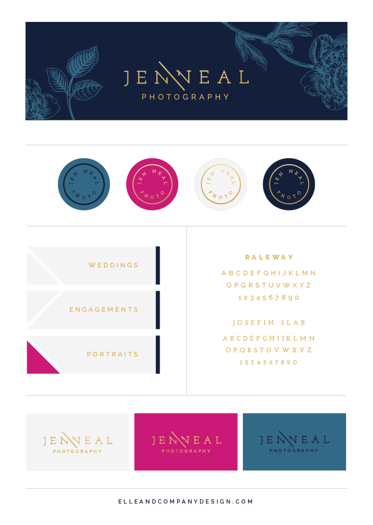
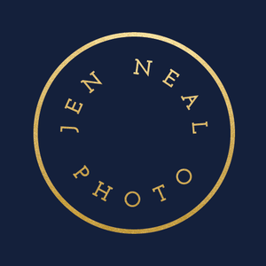
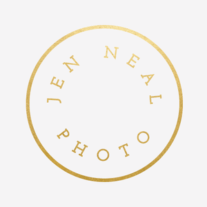
After we settled on the primary logo, I came up with a secondary logo to give Jen a little more versatility. While the original horizontal format works great for things like website headers, stationery, and cover photos, it doesn't work quite as well inside of a perfect square or circle. This secondary logo is a much better alternative for profile photos and icons.

By setting standards for the logo formats and how each one will be used, we already started to develop that "system" I mentioned earlier.
STEP 4 | Color palette
Once we decided on the form and composition of the logos, I came up with a few different color options for them.

On navy, white, off-white, and pink backgrounds, Jen's logo is always gold. On the lighter blue, Jen's logo is always navy. By setting boundaries for how Jen's logo is used, we're able to maintain consistency throughout the entire brand.

Step 5 | Collateral items
While I try to lay out as much of the brand as I can before I get started on the collateral items, sometimes it's helpful to jump in and add to the system as I go.
Before I got started on Jen's website, I designed her business cards, stamps and stickers, thank you cards, Facebook graphics, and an email signature.

I played off the simple lines in Jen's logo in her business cards and email signature and used the pink sparingly for a bright pop of color.
Because I wanted the collateral items to feel collected, I didn't use all of Jen's brand colors on each item. Instead, I used that simple color system to determine background colors and logo colors and mixed and matched them throughout. All of the items are still cohesive, but they aren't over the top matchy-matchy.
I'm a little biased, but I love how these turned out (especially those business cards!).
Step 6 | Website
But nothing was quite as fun as seeing all of the colors, fonts, and design elements come together in Jen's new website.
In the website questionnaire I gave Jen at the beginning of the process, I asked Jen about the purpose of her website, what some successful user outcomes would be, and what she wanted to emphasize most. Because many potential clients find her through her website, she wanted to place the most emphasis on her photos so clients would see her work and book her services.
So that's what I focused on. I came up with a layout that featured Jen's photos front and center and I hid the top navigation so users would have to scroll down the page, view her work, and then access the other pages on her site.

The fun buttons beside the photo gallery slideshow incorporated some of that fun geometry that's seen in other elements of the brand and Jen had the fantastic idea to bring in some interest to the header through a bold floral pattern. I love the contrast of the clean lines and the organic shapes.
And you know what I love even more? This site was designed in Squarespace without a single bit of code. Click here to see it for yourself!
By determining the fonts, colors, logo variations, and patterns, we created a system for Jen and maintained consistency across every aspect of her brand.
What do you think about this new brand and website for Jen Neal Photography?


