

Designing a logo is much more difficult than it appears on the surface.
As with anything that looks easy, there are many tricks of the trade involved to make a logo look visually pleasing and appeal to the right audience.
You may have discovered this already, whether you’ve tried your hand at designing your own logo or you’ve designed logos for other business owners.
But over time, as you learn more about design and gain more experience, you start to pick up some tricks of the trade and learn to avoid some common logo mistakes.
Here are 7 that I come across fairly often (along with some easy ways to fix them!).
Download the Free Brand Challenge Workbook!

Subscribe with your name and email address to access to the in-depth workbook for Elle & Company's Brand Challenge.
Mistake #1 | Using competing fonts
The problem
When fonts are too similar, they compete with each other. Especially if they have a lot of character.
Our eyes automatically try to make sense of a design by ranking the most important elements and least important elements. This is called hierarchy.
Designers use hierarchy to highlight the most important words and aspects of a logo, and downplay the lesser important features of a logo.
So when you have a lot of fonts vying for your attention, it isn’t visually pleasing. Your eye has nowhere to land first, second, third.
The solution
The best rule of thumb when pairing brand fonts? Contrast, contrast, contrast.
Choose one “feature font” to highlight the most important word/words in your logo. Then choose a simple font for words of secondary importance.
By including one memorable font and one simple font, you’re able to create hierarchy and guide a viewer’s eye around the design in a way that makes sense.
You can also create contrast by mixing up font weights and sizes.
And if your logo has other components (like illustrations) that are detailed and have a lot of flair on their own, you might even choose to keep all of the fonts simple so the illustration stands out.
For more on how to choose and pair brand fonts, take a look at this Elle & Company post: Finding, Choosing, and Pairing Brand Fonts
Logo examples that get this right

When you look at this logo, which word stands out the most?
Spindle - the name of the cycling shop - pops out because the designer chose a more memorable font. It’s bold, it has fun serifs at the end of the characters, and it’s highlighted by a gold shadow.
The words of secondary importance (the, cycling apparel & gear, ATL, etc.) are downplayed with a simpler, thinner font. It doesn’t have a ton of character, so it doesn’t compete with the other font.
This balance creates hierarchy and easily guides your eye around the design.

The same is true for the Charleston Gourmet Burger Co….

....and this logo for Kaysha Weiner. The fonts don’t compete with each other; they balance each other out.
Mistake #2 | Using all soft colors
The problem
There’s been a trend in using very soft colors for logos in the last five years, often in the wedding industry.
And while it might seem to give off a lighter, more romantic feel, the logo ends up looking washed out and the words of the logo are very hard to read.
It doesn’t do you much good to have a soft, romantic logo if others can’t decipher the name of your business.
The solution
One way that designers make logos appear more professional and legible is to add colors of all values - a light tone, a mid-tone, and a dark tone.
Not only does this provide more versatility throughout the entire brand, but it makes the logo look more finished and it’s much easier to read.
You can still play up the soft, feminine aesthetic through fonts and other details in the logo, but your main priority should be legibility.
For more on how to choose a color palette for your logo and brand, visit this Elle & Company post: How to Create a Distinct Color Palette for Your Brand
Logo examples that get this right
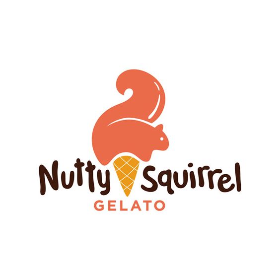
This logo does a great job of using color.
The dark Nutty Squirrel lettering is easily legible, the orange of the squirrel/ice cream and gelato text is a mid-tone that’s still fairly easy to read, and the yellow is lighter but gives it a nice pop of color.

The lettering of The Great Catering Co. logo is white (the lightest of all the colors), but it pops and contrasts with the bright green colors of the background.
Mistake #3 | Forgetting to add one memorable component
The problem
One of the biggest advantages of branding your business and designing a logo is differentiation.
Your logo has the potential to set you apart from all of the other businesses in your industry.
Another advantage is memorability. When people see your logo, there should be one memorable component that sticks with them and comes to mind when they think of your business.
And yet so many people settle for logos that are simply typographic or don’t include a one-of-a-kind detail.
The solution
Your logo should include one key component that catches people’s eye.
Whether it’s a font, an illustration, or the layout of your logo, it should have some memorable feature that sticks with people and sets your brand apart.
So if your logo doesn’t have one element that pops out, revisit it and consider how you can add one component that catches the attention of potential clients and customers and sticks with them long after they see it.
Logo examples that get this right

The name of this restaurant and the logo are both cleverly memorable.
By adding duck feet to something as simple as a fork and knife, this logo not only fits right in with the Silly Goose name, but it stands out and probably brings a smile to those who see it.
I first found this logo years ago, and it continues to come to mind to this day. That’s the mark of a great logo.
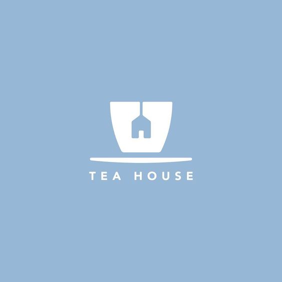
If this logo had just included a tea cup with a normal, rectangular tea bag, it wouldn’t have been very memorable.
But by simply turning the tea bag into the shape of a house, the name of the logo comes to life and the mark won’t be easily forgotten.
Mistake #4 | Adding too much detail
The problem
But sometimes “memorable components” can be taken a little too far.
The problem with highlighting more than one memorable component is again, hierarchy.
When you have too many details, they compete for a viewer’s attention. Their eyes don’t know where to land and how to rank the components of the design.
The solution
Consider which elements of your design are the most important. Highlight one memorable component and simplify the rest.
Another rule of thumb on detail is to make sure your logo is easily legible when it’s downsized to an inch wide.
If it loses it’s detail when it’s scaled down, your design needs to be simplified.
Logo examples that get this right
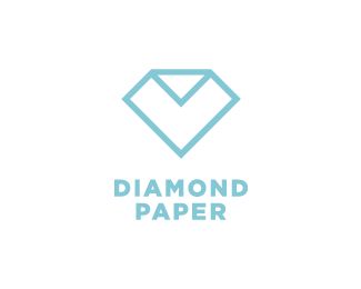
This Diamond Paper logo doesn’t go overboard on detail.
The shape of the illustration is simple and the font is very simple, but the simplicity allows the creativity of the diamond/paper stand out even more.
The diamond/paper mark is the most memorable component, and it’s highlighted because the type and the style of the design isn’t competing for your attention.

Because the illustration of the Area logo is fairly detailed, the designer kept the typefaces simple.
This draws more attention to the illustration itself and makes the logo more memorable.
5 | Taking a literal approach
The problem
While your logo should be relevant to your industry, you don’t have to take a super literal approach.
Just because you’re a photographer doesn’t mean you need to include a camera in your logo, or a painter doesn’t have to include a palette or brushes in your logo.
When you’re too literal, you run the risk of being cheesy and reiterating the same message twice.
The solution
Instead, the best logos subtly hint at recognizable aspects of their business. For example..
Logo examples that get this right

Again, I’m going back to The Great Catering Co. because it’s just too good! I could have easily used it in every example, but I held back and only used it for two.
Instead of using an image of serving trays or food, the designer of The Great Catering Co. chose to use food splatters in all different shapes and colors.
While the splatters relate to food, it isn’t super literal and instead, it becomes clever.

The lotus-shaped plant in the Aleynn Spa Center logo hints at a calm, organic atmosphere. It sets the stage for the experience you can hope to receive when you book their services.

The Wintergreen logo is very geometric, so the snowflake/evergreen tree branch illustrations and the lines of the lake aren’t overly literal.
6 | Using no creativity (too similar to everyone else's)
The problem
It’s easy to get tunnel vision when designing a logo.
You might go on Pinterest to find some inspiration, find some examples you like, and before you know it, you’ve designed a logo that’s very similar or follows the same style as many of the examples you’ve pulled from.
Before long, everyone in the industry has a similar logo and there’s no differentiation.
When your logo is too similar to everyone else’s, you miss out on a huge opportunity to set your business apart.
The solution
Step aside from all the other logos out there, get creative, and start from scratch.
Whenever I design logos for clients, I refrain from looking at any other logos for inspiration for fear that I might even subconsciously mimic other designs I’ve seen.
While it might feel risky to step outside of the box and do something that hasn’t been done before, you’re setting yourself up for an awesome opportunity to set that logo apart.
For an inside look at my custom logo design process, visit this Elle & Company post: My Process for Creating Custom Client Logos
Logo examples that get this right

I know, a moment ago I told you that photographers don’t need to include a camera in their logo. But this mark is so clever!
Instead of going the usual scripted font route, this designer chose to get creative and design a mark that combined symbols for both weddings/engagements and photography.

Again, another memorable logo that combines both words in the business name. The creativity and simplicity of this logo sets it apart.
7 | Not allowing for variations
The problem
While a horizontal, rectangular logo might work great for the top of your website and letterhead, it doesn’t work well for profile photos and favicons. And vice versa.
Your logo should be versatile. You should be able to break apart the different components and rearrange them in a way that’s recognizable but flexible.
But many logos aren’t created with variations in mind.
And it isn’t long before a business owner begins to place the logo on social media accounts, their website, and other collateral items that they begin to realize that it doesn’t fit well in different formats.
That can be really frustrating.
The solution
How can different aspects of your logo can be taken apart and rearranged for more versatility?
Consider how your logo will look in a rectangular/circular format as opposed to a horizontal format and try to create variations that will accommodate them.
For inspiration on different logo formats, visit this Elle & Company post: 5 Types of Logos to Incorporate in Your Brand
Logo examples that get this right

This Fort Point Logo works well with the lattice design and Beer Co. text, but it also works well on it’s own.
The ability to pull out the different components and use them all together makes this logo very versatile.

The same is true for the Yolk logo.
All of these design elements work well together, but you could easily pull out the Yolk text with the Breakfast, Backyard, and Bar text beneath it, you could use the Yolk text on its own, you could use the Yolk text with the sun illustration above it…
There are a bunch of ways you can rearrange and switch up the format and still make each version cohesive.
Download the Free Brand Challenge Workbook!
Subscribe with your name and email address to access to the in-depth workbook for Elle & Company's Brand Challenge.
Were you making any of these 7 mistakes with your logo?
If so, they’re easy to fix!
By keeping your logo simple, highlighting one key component, and adding contrast to your fonts and colors, you can improve your logo and differentiate it from all the rest.


