It was so frustrating.
I just wanted to create a site for my upcoming course that (a) was easy to use, (b) looked like my brand and (c) allowed students to login under their own account.
I tried sites like Teachable and Teachery. But they took people off of my site and I found myself coming up with creative workarounds to customize the look and function of my course on their sites.
Surely there had to be a better way.
And then I had an idea.
What if I were able to host my course on the Elle & Company site through Squarespace?
I’m already familiar with the platform.
I know how to customize it and keep all of the graphics consistent with my brand.
And the more traffic I can drive to my site, the better my site’s SEO.
But there was just one hangup...
I needed to find a third-party site that would allow me to protect my course pages and create individual logins for each one of my students.
Here’s the good news: I found a solution, my course page is up and running and I’m going to share exactly how I set it up in this post.
Step 1 | Set up your landing page
Whether you’re setting up a brand new Squarespace site for your membership content or you’re setting up a membership page within your existing Squarespace site (like I did for my course), it’s best to start by creating a landing page.
I didn’t want my course landing page to pop up in my site’s navigation, so I set it up as an unlinked page by clicking the + icon at the top left corner of the Not Linked section in my Pages menu.
I named the new page Main Menu, chose a blank layout (because I like setting up new pages from scratch) and clicked Start Editing.
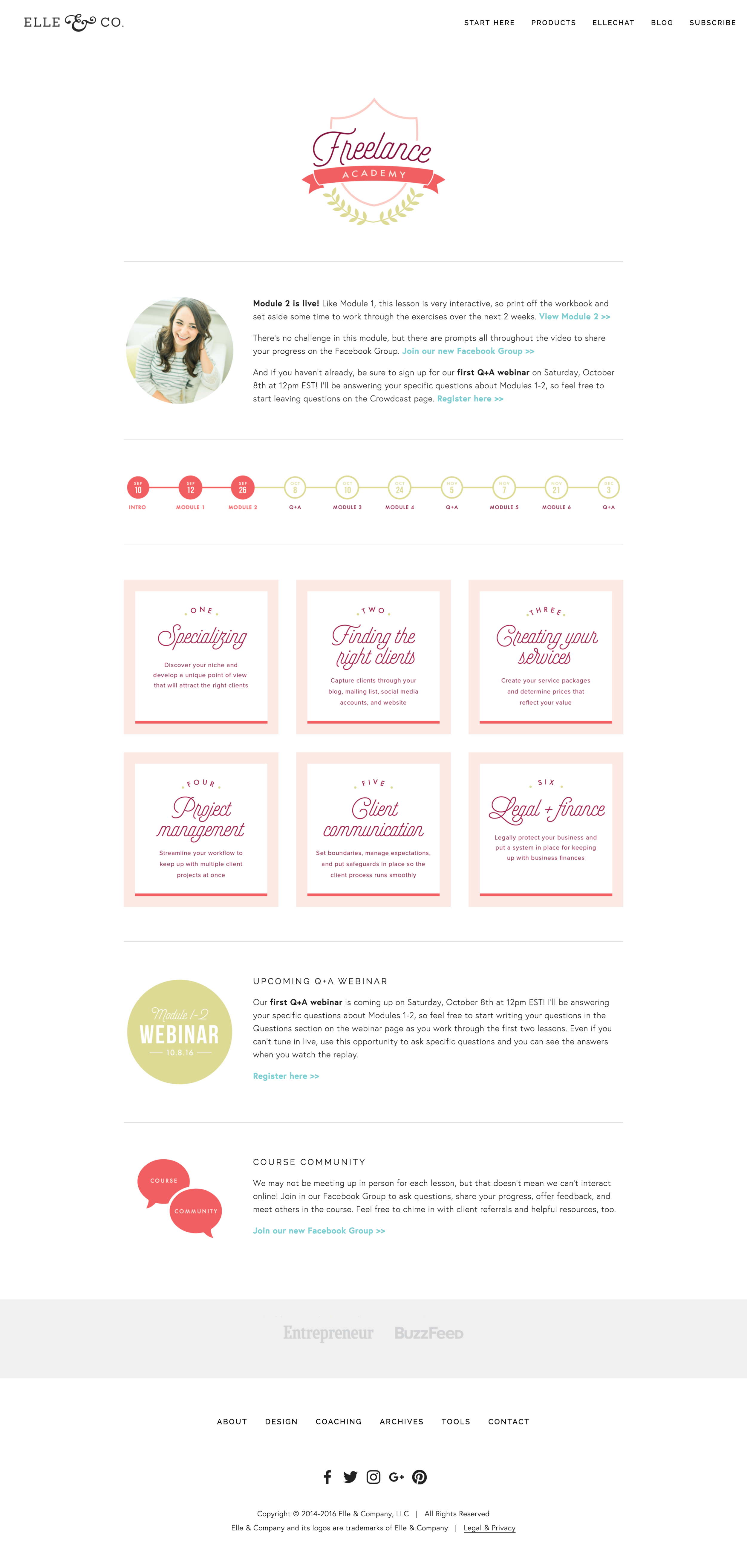
From there, I had a blank canvas to start creating the landing page for my new course, Freelance Academy.
I branded the course ahead of time and designed the logo, headers and other visuals in Adobe Illustrator, so they were all set and ready to go.
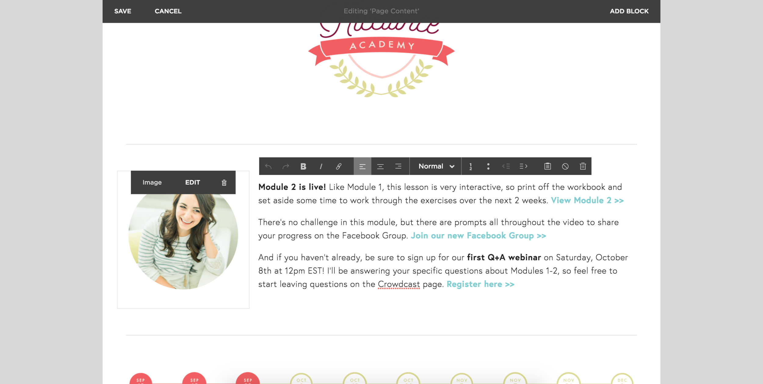
I placed the course logo at the top of the page using an image block.
But instead of creating a long horizontal header image, I kept the logo in a square format and added 2 spacers on either side so the logo would appear large in mobile view.
Sidenote: Did you know that you can see your site in mobile and tablet view by either adjusting the size of your screen or clicking the line/arrow at the top of the preview window? Pretty nifty.
Line blocks are a great way to subtly divide content, so I used them to separate the different sections of my course landing page.
I also put some consideration into which information needed to be seen first when students landed on the course page.
Course announcements and updates needed to be front and center, so I added an image block with a headshot of myself (to make the course a little more human and personable) and dragged a text block beside it to keep students posted on the latest information.
Below that, I created a timeline image in Illustrator and added it to an image block so students can keep up with exactly where we are in the course at any given time.
I do have to update the timeline image every time a new module goes live (which is every 2 weeks), but it takes me less than a minute to open the Illustrator file, make edits and upload a new timeline image to the site.
The module graphics were also set up using image blocks and I arranged them in a grid.
You could also use a gallery block to do this but again, I wanted the module graphics to appear large in mobile view (whereas a gallery block would still feature the images side-by-side, making them smaller and making the text hard to read).
I finished setting up the landing page by including sections for upcoming Q+A webinars and the course community using image blocks and text blocks.
My goal for this landing page was to showcase the most important information and help students navigate the site.
Once it was ready to go, I clicked the gear icon next to the page listing in the Not Linked menu to open the page settings and changed the URL from /main-menu to /freelance-login.
Not only do I have main menus for other courses, but this custom URL will come in handy when I connect a third-party site to secure the page in just a few steps...
Step 2 | Set up your interior pages
Once the landing page was ready to go, I needed to set up the other interior pages for my membership site.
To organize the new pages, I created a folder in the Not Linked section of the site navigation and added a new blank page for each interior page.
It just so happens that my Squarespace template, Hayden, automatically creates a navigation menu for all of the pages included in a folder, which is perfect for helping students easily maneuver around the site.
I would love to take all the credit for figuring that out ahead of time, but it turned out to be a happy surprise.
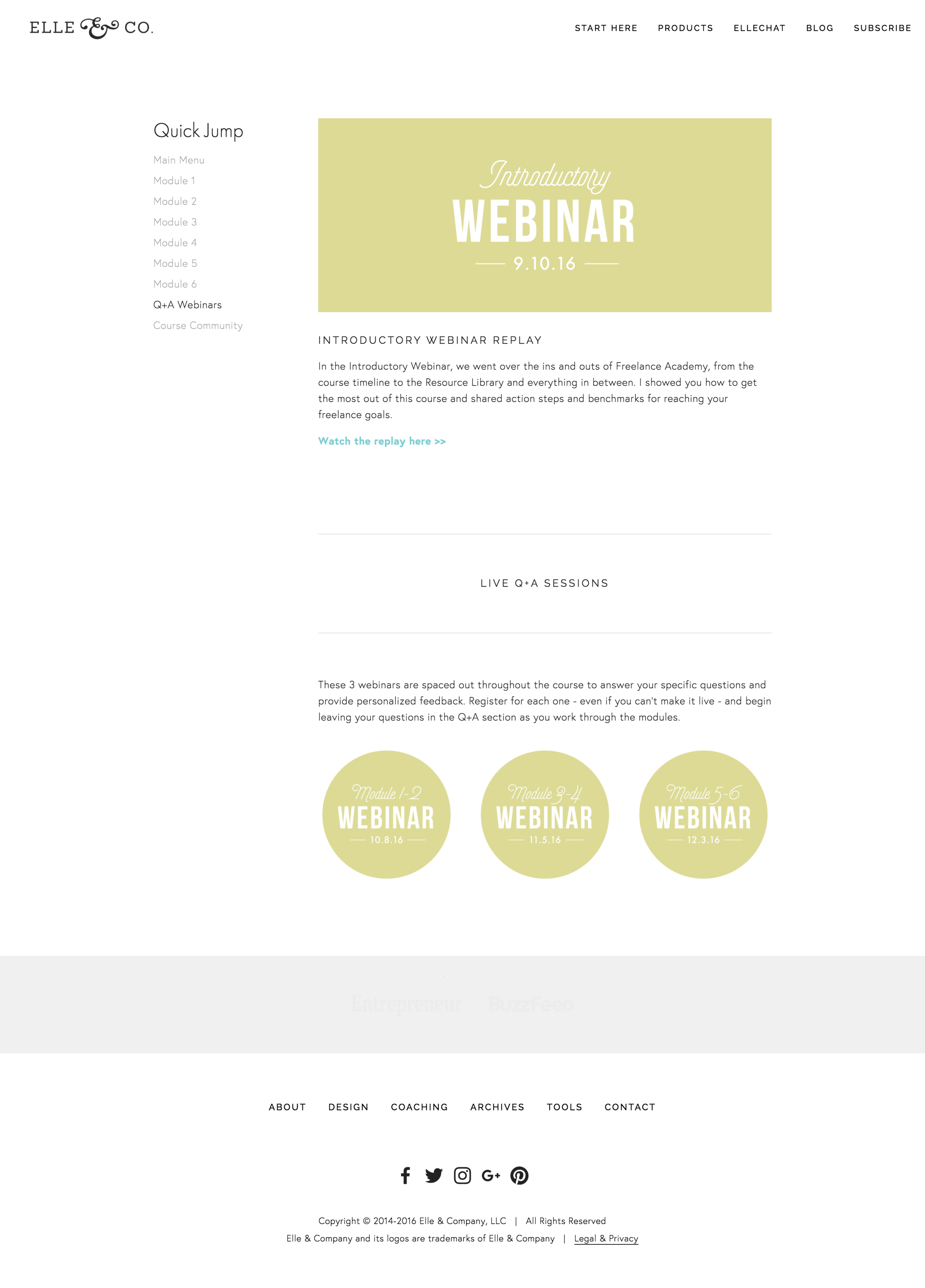
I named the folder Quick Jump in the page settings, added a link to the Main Menu, and my interior page navigation was ready to go.
You can also add links to external pages in the folder, like Facebook groups, so they appear in the course navigation menu.
Then I went back through and set up each interior page using image blocks, text blocks, and video blocks.
Click the arrows above to take a look at some of the full page layouts for Freelance Academy.
Just like I did with the landing page, I went back through and assigned custom URLs to each of the interior pages.
To keep the page URLs consistent, I used /freelance-login/ and then added the page title after. So for example:
Module 1 - /freelance-login/1
Module 2 - /freelance-login/2
Module 3 - /freelance-login/3
Q+A Webinars - /freelance-login/webinars
Again, this will come in handy in Step 3, but it’s helpful to go ahead and get them set up ahead of time.
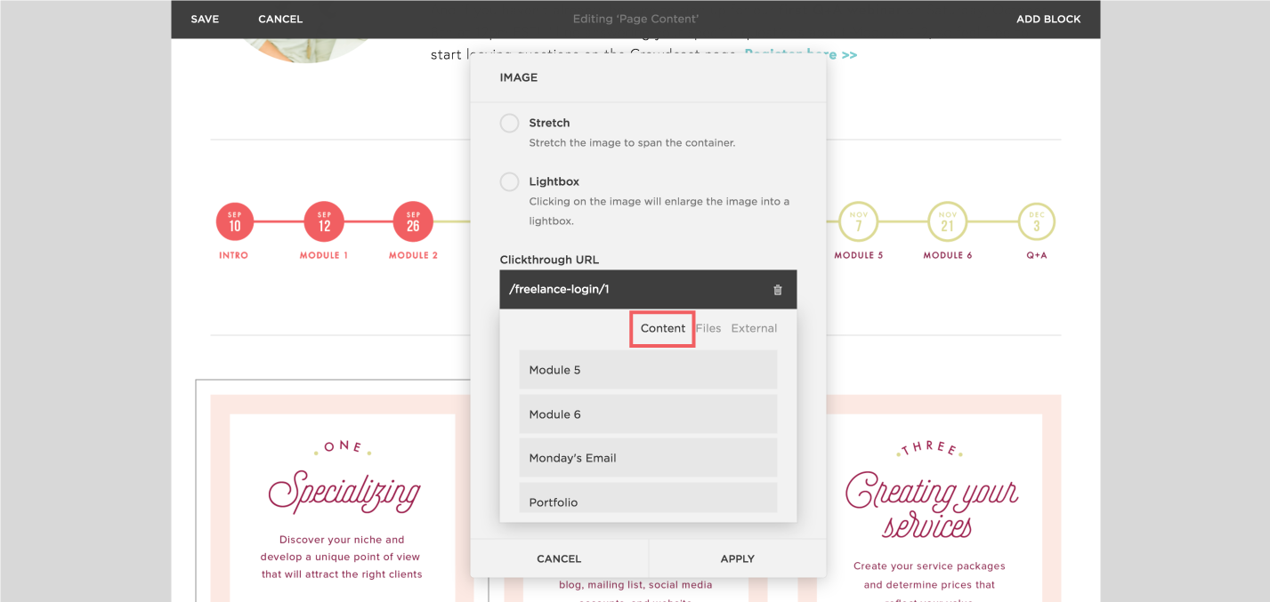
Because once all of the interior page URLs were set up, I revisited the course landing page and linked all of the modules, webinars and other buttons to the new interior pages.
If I had waited to change those URLs until after Step 3, I would have had to go back through and relink everything.
Sidenote: Squarespace makes it really easy for you to link to interior pages. Instead of tracking down each individual URL for the pages on your site and entering it under the External tab, click Content and find the page you want to link to.
Step 3 | Protect your course pages using MemberSpace
After researching third-party membership options for Squarespace for months, I kept coming up empty-handed. Everything I found seemed to either be too complicated or poorly designed.
And then I found MemberSpace. [Hallelujah chorus]
MemberSpace not only creates a separate account for each student to access your membership site, but it protects your content and it’s the easiest, most well designed option I’ve found.
To connect it to my site, I signed up under the Growth Plan and logged into my new account.
In the dashboard, I clicked Member Pages in the top navigation and then Add Member Page.
Under the Enter the page URL section, I typed in /freelance-login/*. By adding the asterisk at the end, MemberSpace will protect any pages on my site that include /freelance-login/ in their URL and require people to login if they somehow land on those pages.
See how setting up all of those individual URLs ahead of time came in handy?
I also set up two different payment plans under the Member Plans tab to test it out, but I ended up using Gumroad for course enrollment. I’ll get to that in a moment.
After the URL was set up, I clicked on the Install tab and copied the code in the Add Install Code section.
Going back to my Squarespace site, I visited the main menu, clicked Settings > Advanced (under the Website section) > Code Injection, and then pasted the code in the Header section.
And just like that, my membership content was officially protected on my Squarespace site!
MemberSpace allows me to protect my new e-course by creating individual logins for my students and keep my course on my business's home base -my website. I couldn't be happier with how easy it was to integrate Squarespace and MemberSpace. If you have an e-course in the works, Elle & Company readers can get 10% off their MemberSpace subscription for the first 3 months with the code elle&co.
Step 4 | Student enrollment
While MemberSpace allows you to set up Member Plans and charge for access to your membership pages, I chose to use Gumroad for student enrollment for a couple reasons.
First, I had already set up pre-orders on Gumroad ahead of the official Freelance Academy course launch. I thought it would be helpful to keep up with both preorders and regular orders all in one place.
And second, Gumroad allows me to set up payment plans and coupon codes. MemberSpace doesn’t allow those functionalities just yet.
Once students enrolled in the course, I visited the Members tab in my MemberSpace dashboard, clicked Add Member at the top of the screen and manually entered their name and email address.
As soon as they were added, they received an email that walked them through setting up their account and they were immediately able to access the course.
Yes, this is a little more tedious than having used the Member Plan options and I might switch it up during my next course launch, but all in all it worked out just fine.
I’ve been extremely pleased with using Squarespace and MemberSpace to host my new e-course, Freelance Academy.
Not only am I able to quickly customize and edit the course pages, but I’m able to maintain brand consistency and drive even more traffic to my website.
Do you have any questions about the process? Feel free to ask them in the comments section below!
Which apps and websites have you used for showcasing and protecting your membership content? Have you used Squarespace to host a course or resource library?

