My 2-week design process has made things a little busy around here! I've booked over 20 projects for 2015 and it feels like this year has flown quicker than all the rest.
With little turnover time between clients, e-courses in full-swing, and the launch of the Collaborative in less than one week, I have a few fun brands that haven't made an appearance on the blog quite yet.
So if you enjoy Elle & Company client project reveal days, you're in for a treat. I have 3 new brands and websites to share with you today (along with a little snippet of the process behind each one)!
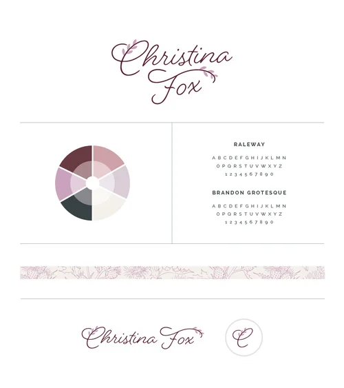
Christina Fox

I'm always looking for clients whose occupation and brand is different from those I've worked with before. So when Christina Fox, a Christian author and blogger, contacted me about redesigning her brand and website last winter, I jumped at the opportunity.
While the organization and functionality of Christina's previous site worked well, the design wasn't a good fit for her audience of women between the ages of 25-45. She wanted something more feminine with shades of purple and a hint of floral illustration. Christina used the words real, honest, friendly, winsome, engaging, penetrating, devotional, Christ-centered, grace laced, and encouraging to describe the qualities of her new brand.
So as always, I started the design process by creating an inspiration board to make sure that Christina and I were on the same page visually.

I brought in all kinds of purples, soft textures, and photos that brought in a warm, relaxed, and inviting atmosphere. The result is cozy, friendly, and feminine.
Next, I came up with a couple logo concepts for Christina to choose from.

Each utilized a leaf detail with a classic, feminine font, but my personal favorite was concept 3. The slanted script lent itself best to the visual direction of the inspiration board. I was thrilled when Christina chose to go with concept 3, too.

From there I created a couple different logo variations for versatility. While the primary logo fits well for a blog header and most collateral items (like Facebook cover images and business cards), it's often helpful to have alternative logos that fit better within a square or horizontal format.


Christina also made a special request to incorporate thistles in her brand in some way. I tried my best to incorporate them into the logo, but the intricate details of a thistle illustration were lost when the logo was downsized. So I got creative and used them in the design of a custom pattern for Christina, instead.

Once the logos were finalized, the pattern was created, and the fonts and color palette were narrowed down, I incorporated all the brand elements into Christina's collateral items.


While I'm thrilled with how her business cards and social media images turned out, my personal favorite was seeing everything come together in Christina's website.
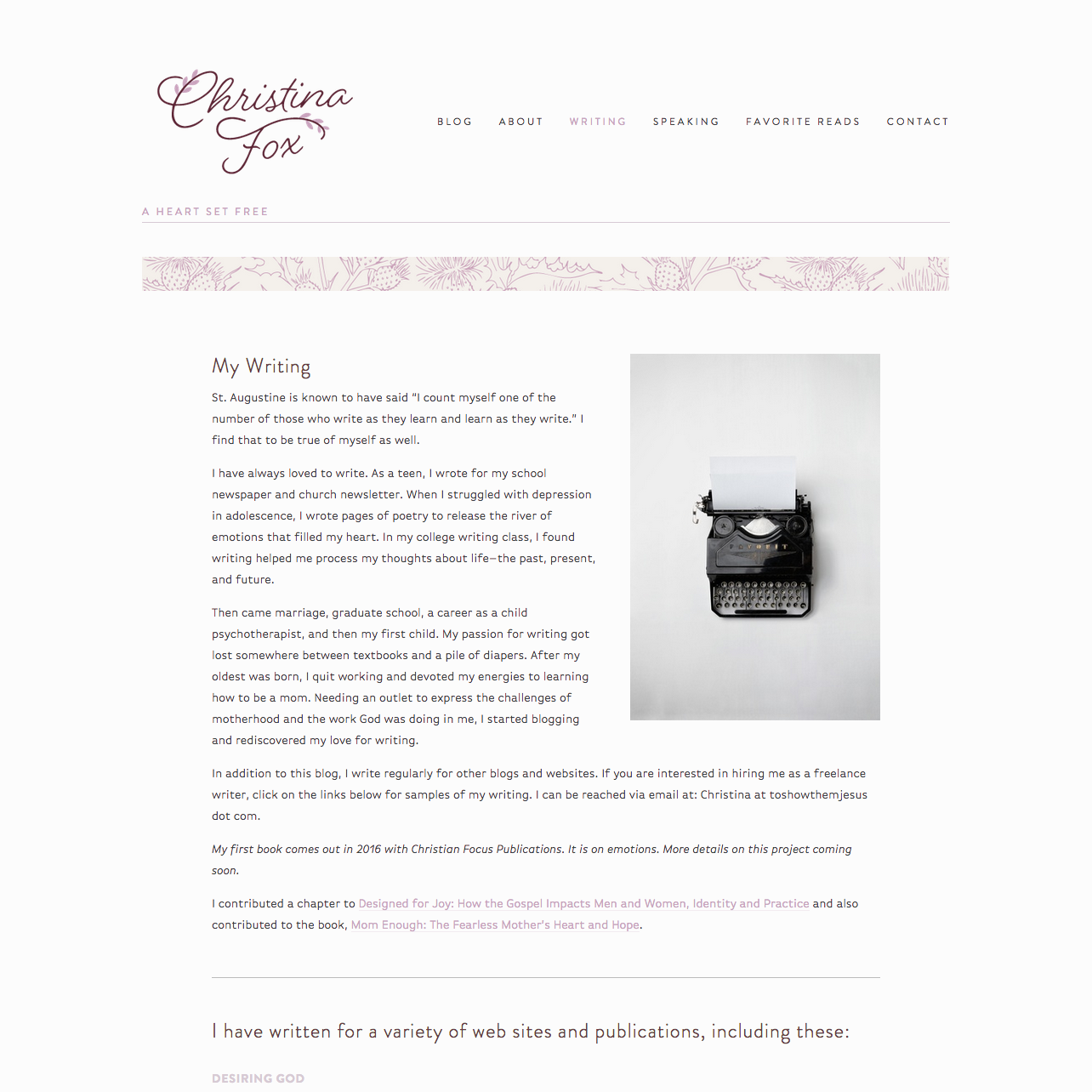
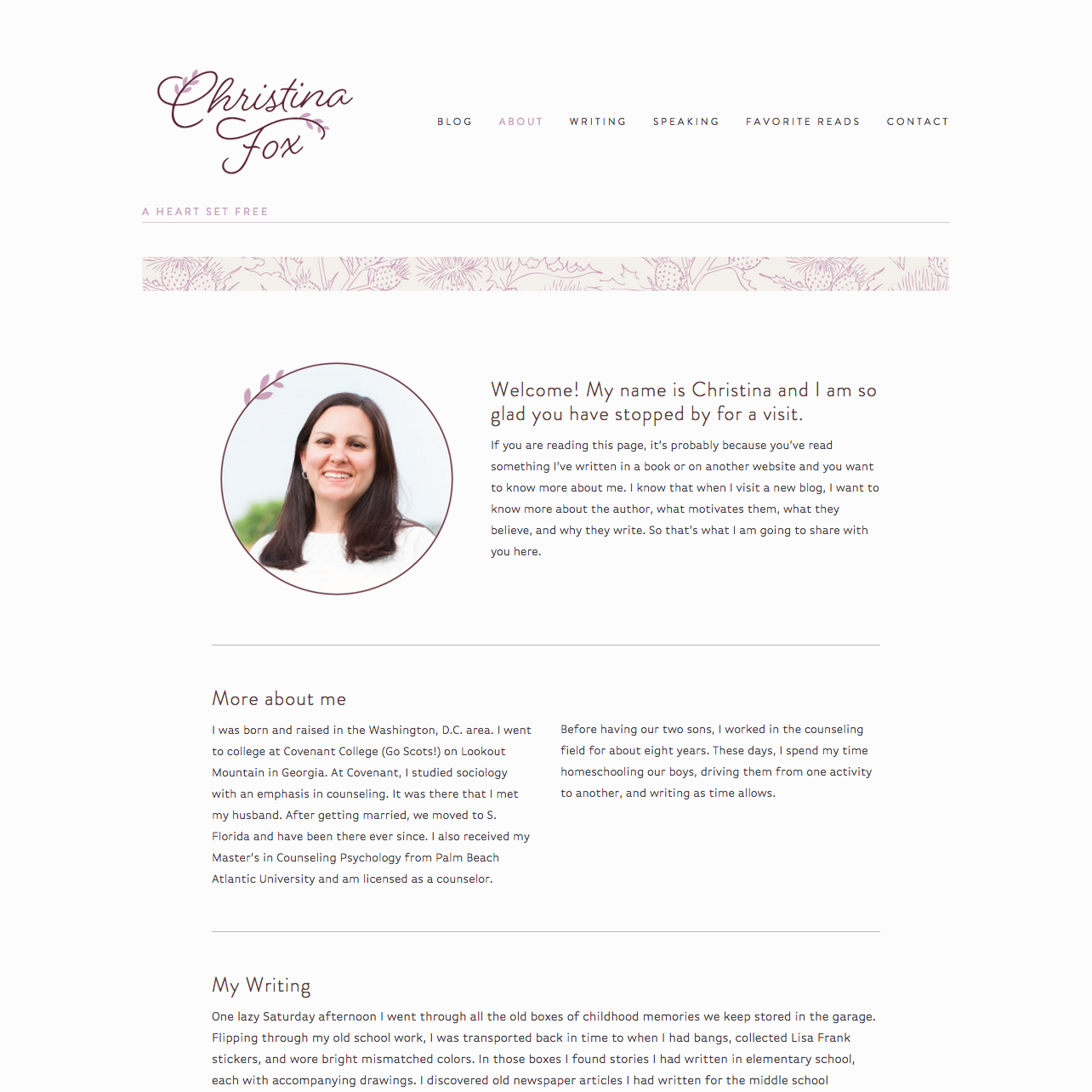
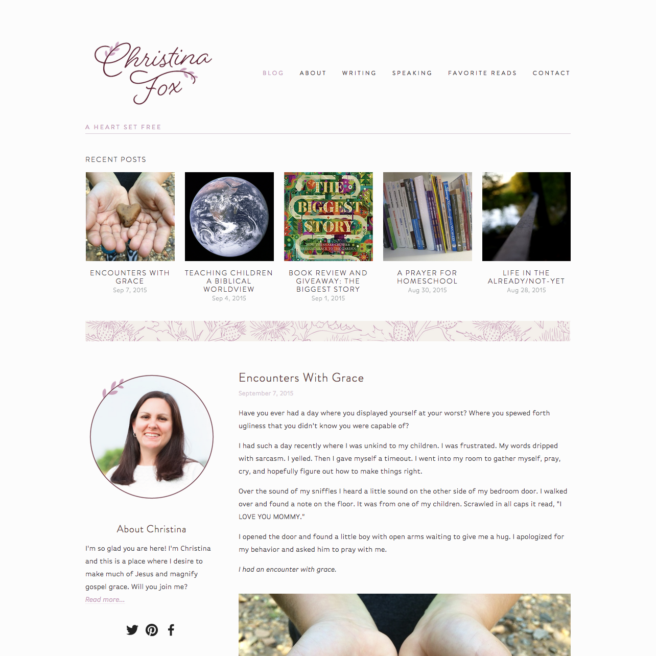
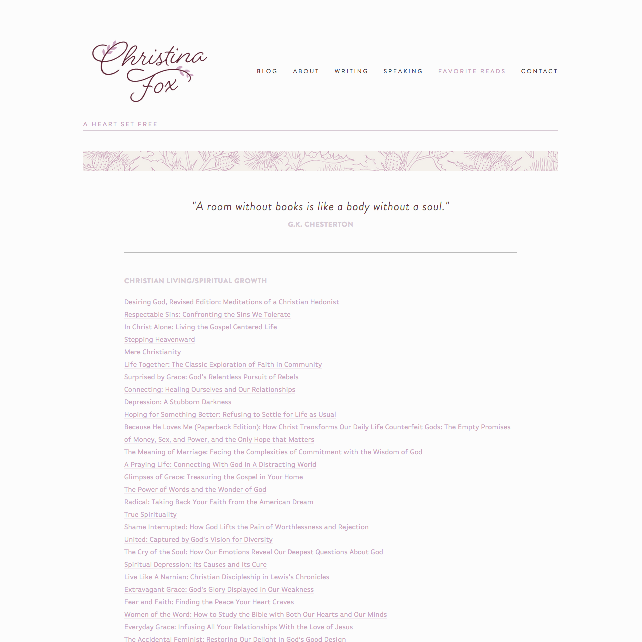
Click here to see Christina's new website in action and browse through her articles. Also be on the lookout for her new book coming out in 2016!
Christy Schmid Photography

While I've worked with several photographers on brands and websites, I had yet to work with a senior portrait photographer. So I was thrilled when Christy Schmid reached out to me last winter about a brand and website redesign for Christy Schmid Photography.
Not only is Christy friendly and fun to work with, she's extremely talented at portrait photography. Her previous brand was on the right track with the color palette and aesthetic that would appeal to her ideal audience - high school seniors - but it needed a little refining to match the level of her gorgeous photos.
Christy used the words modern, fresh, fun, feminine, fashion-forward, stylish, classy, upscale, and exclusive to describe the direction she was going for. And when the words "Kate Spade inspired" left her lips, I hit the ground running with one of my favorite inspiration boards to date.

From there we moved onto the logo. After a few revisions, Christy and I landed on a mark that incorporated her favorite Bodoni font, a crest that incorporated both boy and girl seniors (heart for the ladies, bow tie for the guys), and a touch of gold foil.

This logo gave Christy a lot of versatility because the elements can be used separately; the crest works well for square and round formats while the wordmark can be used for horizontal layouts.
Once the logo was finalized, I had some fun combining the bright colors, bold fonts, and fun patterns of Christy's brand onto collateral items. We came up with all sorts of print material from business cards to envelope liners and everything in between.

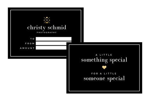
Christy also requested a design for gift cards. Such a great idea!
Lastly, I took all of the brand elements above and incorporated them into Christy's new Squarespace site.
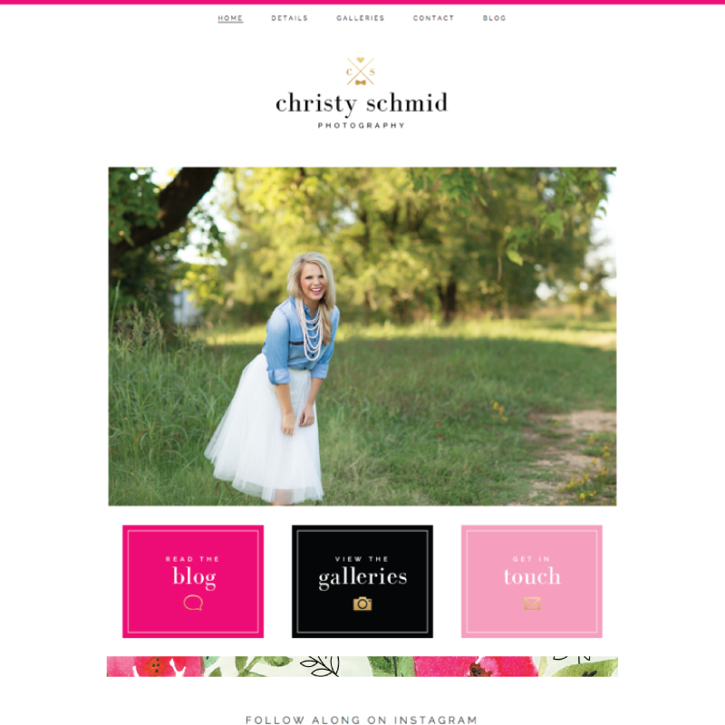
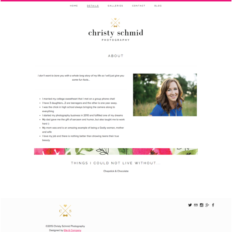
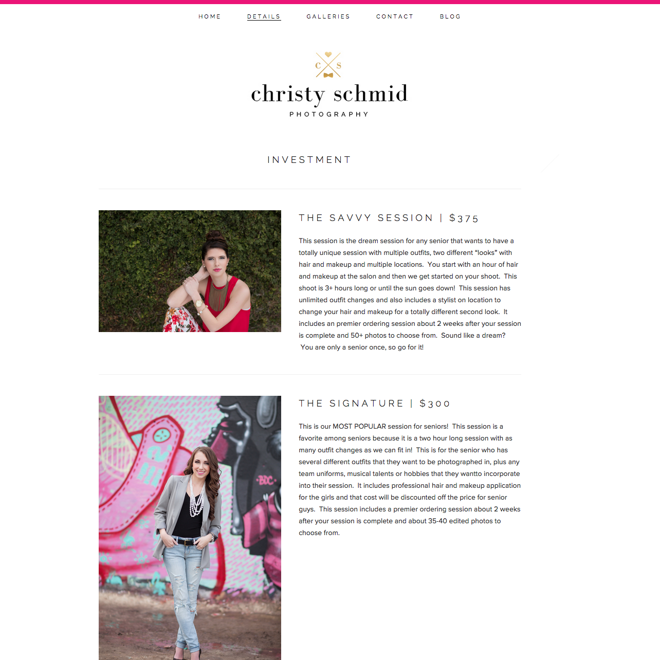
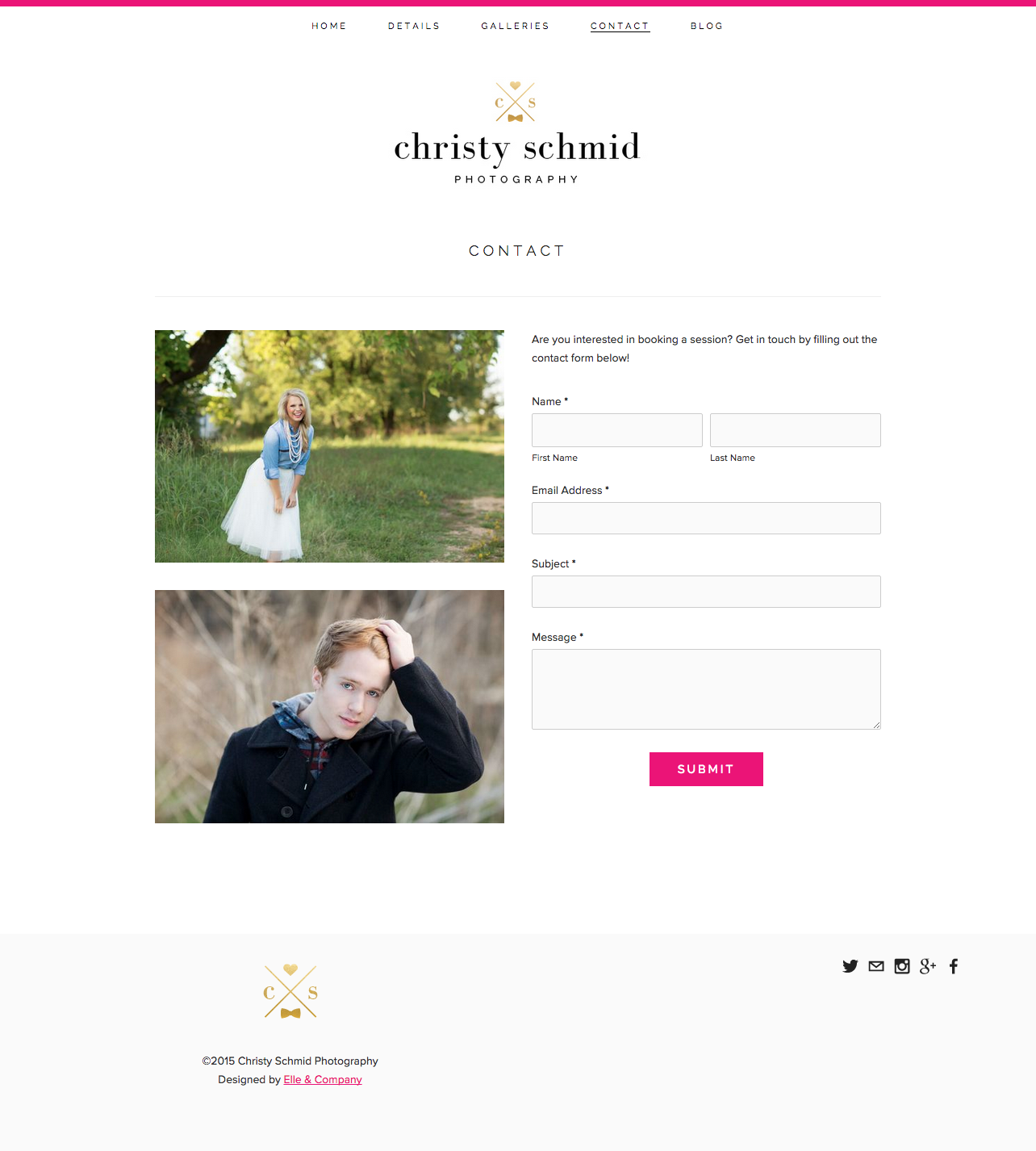
Click here to visit Christy's new site (and if you know of any seniors in Ohio who need senior portraits, be sure to put them in touch with her - she's great!).
Price's Country Store

I met Janet Price at the Bloom Workshop in Atlanta last fall and we hit it off right away. She told me all about her recent move to Alabama with her husband, son, and mom to pursue a slower-paced life, where people pump your gas for you and the gas station still sells coke from the bottle.
A few months later Janet booked my services to design a blog that would capture their pursuit of a simple life on their farm, sharing recipes, stories, and entertaining ideas. I knew this would be something fun and different for me, and it was one of the projects I was most looking forward to take on last spring.
Then, 2 weeks before the design process began I received an email from Janet. That country store she had told me about - that pumps the gas for you and sells coke from the bottle - was up for sale... and she and her husband purchased it! I was thrilled to learn of the new adventure they were on and excitedly agreed to change the design plan from a personal blog to a website for Price's Country store.
In her client homework, Janet used the words convenience, vintage, charming, old-fashioned, friendly, and nostalgic to describe the brand of their new store, so I kept those in mind as I pulled together images and colors for her inspiration board.

Red, blue, black and brown pulled together quite nicely in one of my most different boards to date. I love the contrasting textures, vintage fonts, chalkboard lettering, and illustrations. I kept this board by my side as I came up with 3 different logo variations for Price's Country Store.

Janet and her husband Ken had a hard time narrowing down a favorite; they loved aspects of each one. Ken loved the gas pump in concept 1 (and I'll admit I love it, too). Janet loved the type choices and rooster in concept 2. And they both liked the icons in concept 3.
So I came up with a way to combine them all!

While we stuck with concept 2 for the primary logo, we utilized the gas pump for an alternative logo and brought in icons to be used on collateral items and the website.


I also love how their business cards turned out. The pops of blue and red work well with that little touch of tan behind the logo. And those icons - I just can't get over those icons.

We ended the design process with their website and went with a light gray background, just to switch things up a bit!
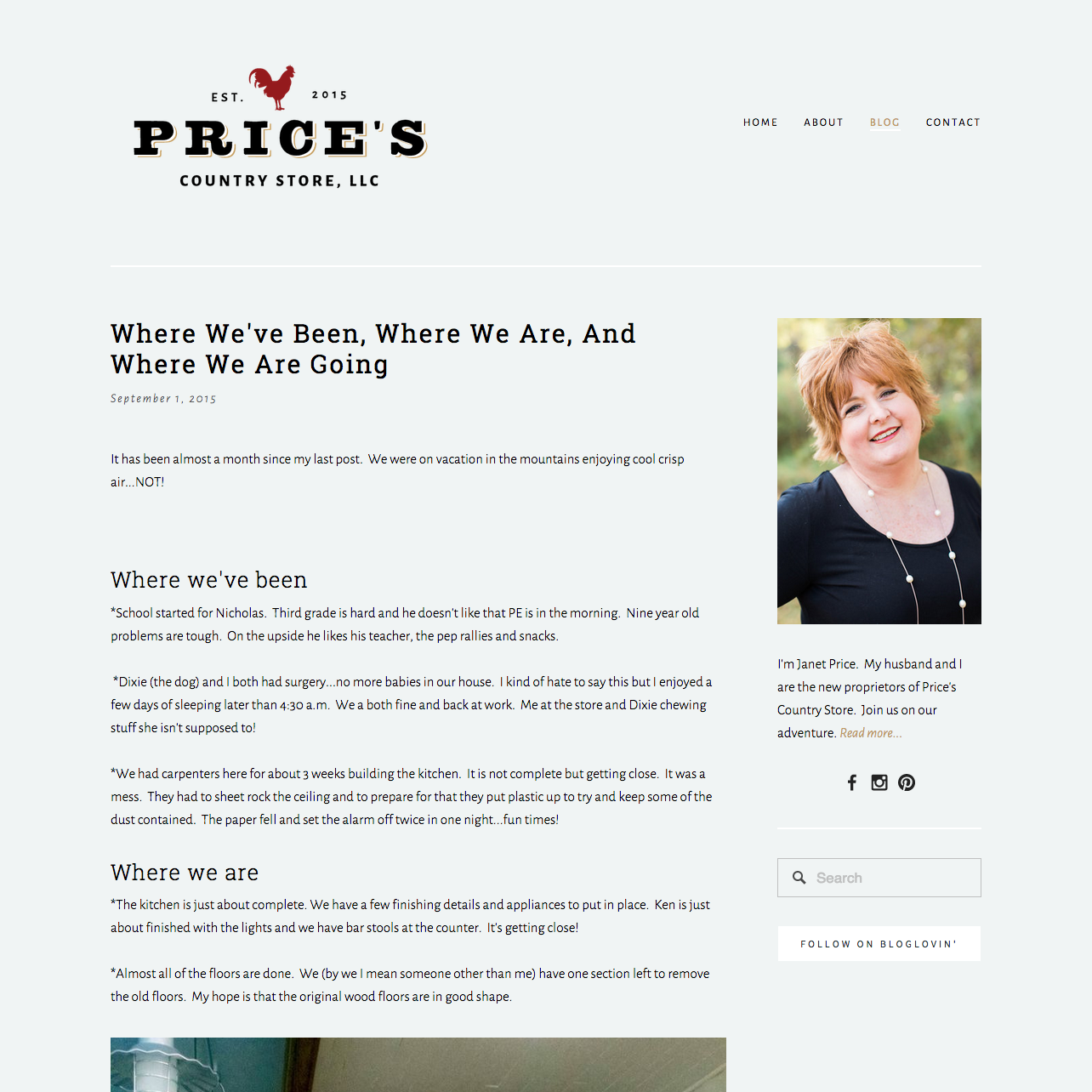
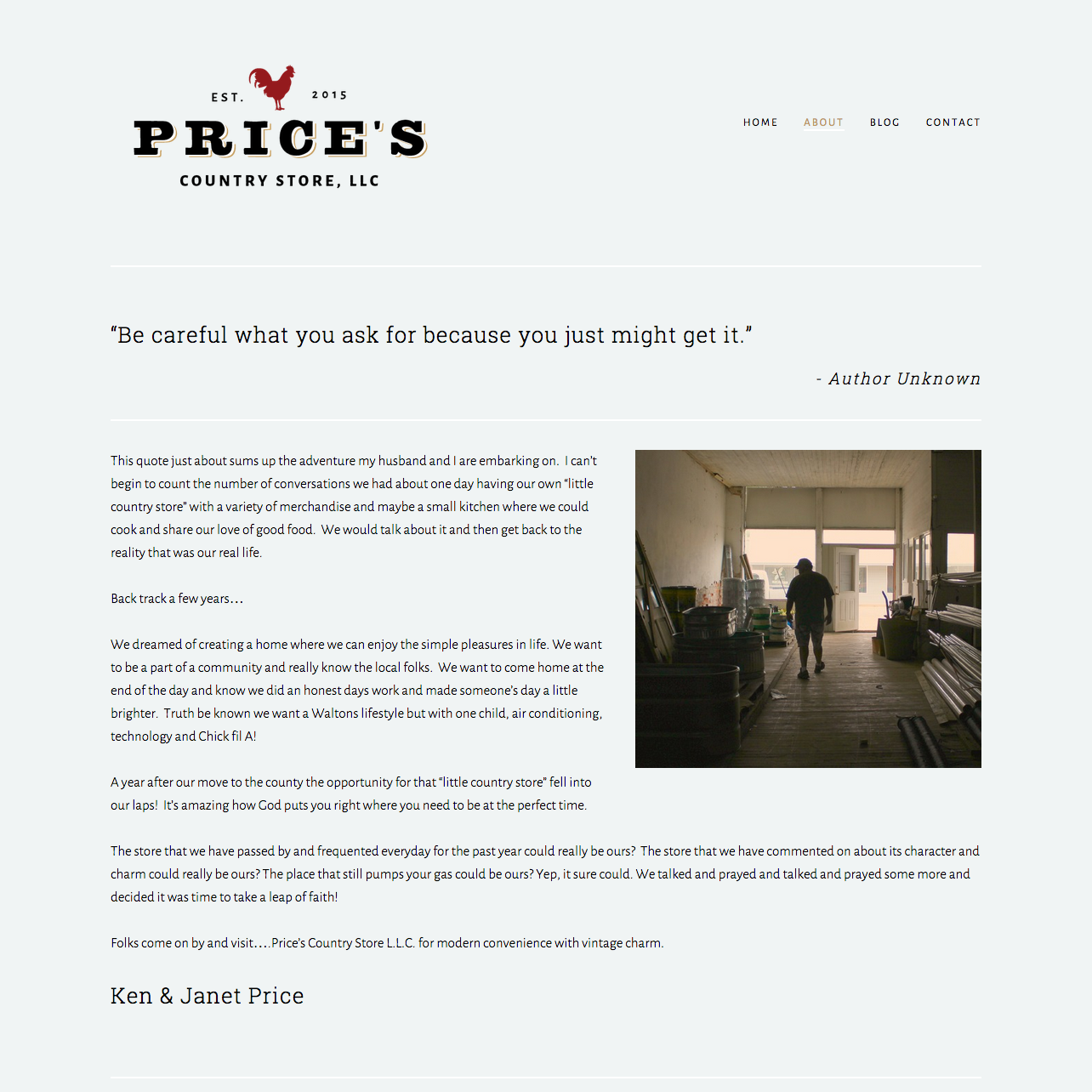
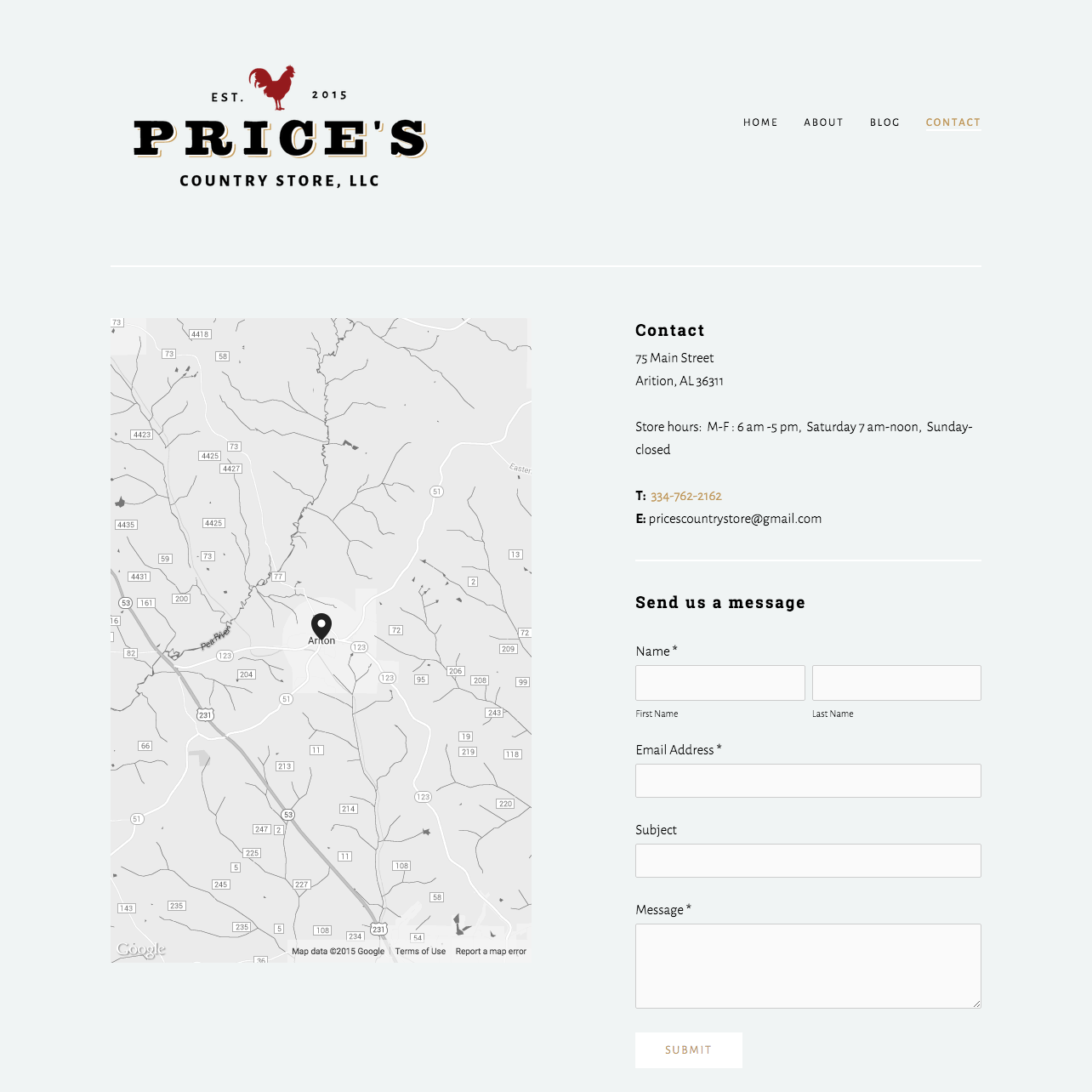
Janet continues to add to the site with updates of the store (they're restoring it and revamping it - be sure to follow along!) and new blog posts. Click here to see their new site in action!
Christina, Christy, and Janet were all wonderful to work with and I'm thrilled with the outcomes of their new, distinct brands and websites.
What are your thoughts on these new Elle & Company design projects? Do you have a favorite?