If I had to choose one thing I love most about designing brands and websites, I don’t know if I would be able to do it.
But I do know that somewhere near the top of the list of favorites would be differentiating each individual brand.
It’s a fun creative challenge to make each client’s brand completely distinct and unique.
And it helps when the mission behind the brand is unique and special all on its own.
Brittany Smith approached me this spring to put a visual face on her newest venture, a resource for teaching moms how to use their DSLRs to capture the lives of their children. But not just the big milestones like kindergarten graduation and family trips; her heart is for showing them how to capture the seemingly mundane, day to day moments.
As soon as I heard about the heart behind Full Circle Photo Project, I knew this would be unlike any other branding project I’ve taken on.
Brittany’s emphasis on teaching meant that I would not only be designing the logo and the website; I would also have the opportunity to design slides, templates, a custom icon set and editable PDFs for her online course.

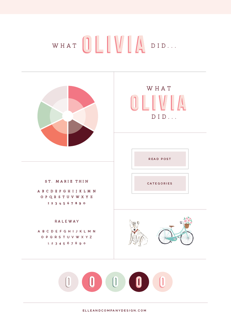
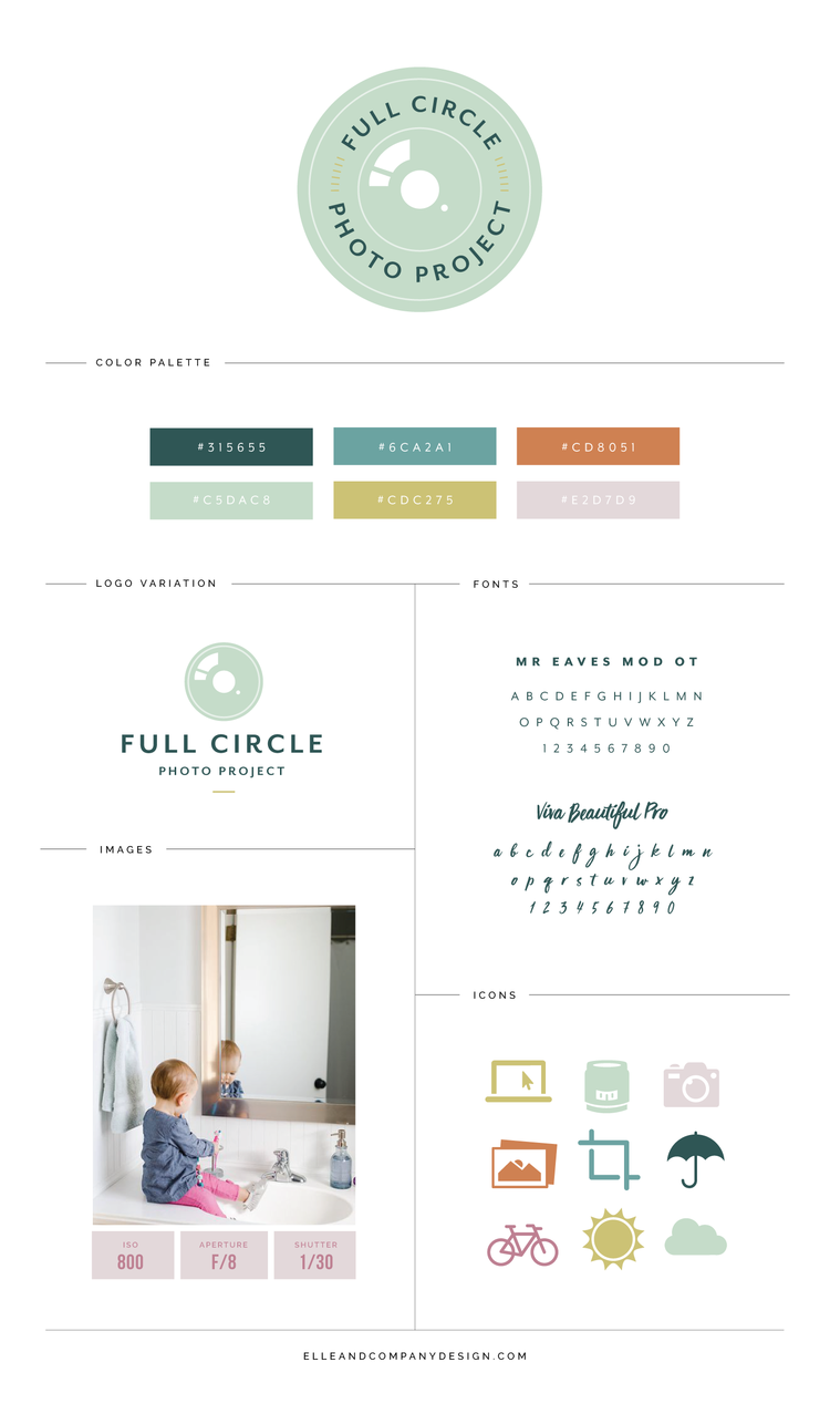
I’m thrilled with how the project turned out, but the brand style board only gives you a snapshot.
Here’s a step-by-step look at how the Full Circle brand and website was created.
Step 1: Inspiration board
At the outset of each design project, I send my clients homework questionnaires to complete before the design process begins.
Within those questionnaires, I ask them to describe their brand in 10 words.
Brittany chose the following:
- Informative
- Inspiring
- Empowering
- Simple
- Natural
- Relational
- Family-focused
- Legacy
- Faithful
- Generous
There are several different ways that we could go about displaying these traits visually through the Full Circle brand.
So to collect my ideas and come up with a visual direction, I like to start the project by developing an inspiration board; a collection of images and colors that I can refer back to as I design the logo, icons and other key aspects of a brand.
Here’s what I came up with for Brittany:

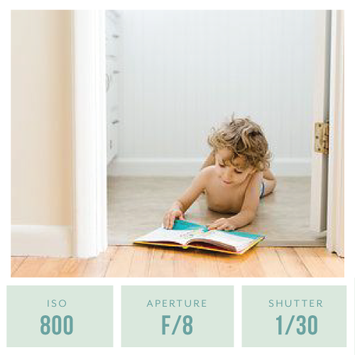
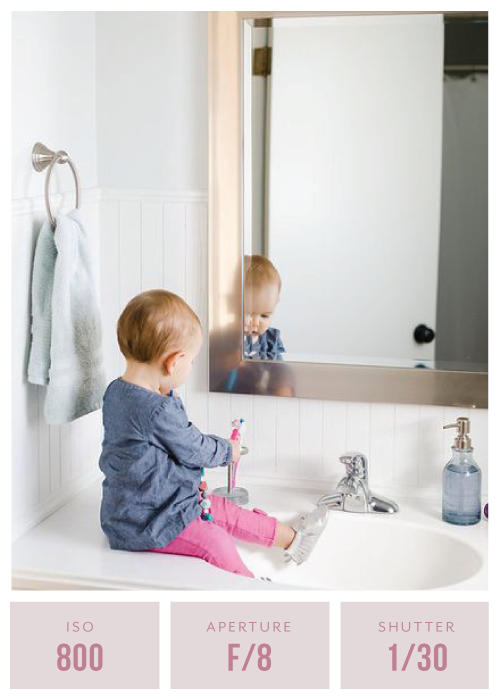
Because the brand is educational and geared toward moms, it needed to be friendly, fresh and simple. I chose bright photos with a lot of white space to reflect those qualities.
The color palette pulls in some fresh blues and a more feminine lilac, but the warmer green and burnt orange balances out the cooler colors and brings some contrast to the brand. The different shades and tones of the colors also adds contrast.
The little boy and girl are actually Brittany’s children, which brings in the relational and family-focused aspects she was hoping for. I also wanted to make sure that Brittany’s photography style would pair well with the color palette and the overall visual style of the new brand.
The photos are also home-focused, and the frames and shelves and plants are all items you would see around your house day-to-day. They’re familiar.
And while the brand is aimed at appealing to moms, it also needed to incorporate a fun childlike feature (because after all, they are going to be taking photos of their little ones). So I included some fun graphics like the ampersand and the cactuses to add a whimsical feel to the brand.
I have to admit - this is one of my favorite client inspiration boards to date!
Step 2: Logo concepts
After the inspiration board was finalized, I moved onto one of the most memorable components of any brand: the logo.
The most challenging part of any logo is incorporating many different aspects into the design while still making it look simple.
I had several different things swirling around in my mind during this stage, like:
- Incorporating a circle into the design (because it is called Full Circle Photo Project)
- Subtly hinting at photography
- Figuring out the composition of a 4-word business name
- And not being overly cheesy or literal
I came up with 3 distinct ideas:

I start in black and white first because I’m most interested in the composition of the logo and how the type and the graphics work together. Color can be a large distraction for my clients, and it can always be added later. But the composition is most important during this stage of the process.
Option 1 was the most unique and geometric of the 3. I kept the type simple to put more of an emphasis on the lens icon in the middle of the logo, and my intention was to subtly hint at a lens cap. Because it’s a perfect circle, this logo option works really well inside a square and the simplicity of it helps it size well.
Option 2 was the most playful and childlike of the 3. Like option 1, it’s perfectly square. The arrow subtly hints at the Full Circle name and while I wasn’t sold on the hand lettering I had tested out for the business name, I would revisit it if Brittany wanted to go in this direction.
Option 3 was the most expected of the 3. The icon incorporates the F and C of the business name while also creating a fun icon that can be used elsewhere throughout the brand, but the stacked layout is common among photographers.
Brittany was torn between options 1 and 2 (and to be honest, I couldn’t choose between the 2 of them either!). She asked to see them both in color to help her decide.

I’m slightly biased, but I love how the colors brought each of these options to life!
You might notice that I also updated the font in the second option to something more streamlined and scripted.
Brittany ended up going with option 1, and I was really excited about her choice. I designed a secondary logo for her to give her a little more flexibility in her new brand, too.

Step 3: Brand style board
A brand isn’t just a logo; it includes all of the visual components of your business like your color palette, fonts, iconography, borders, patterns, etc. It acts as a system.
So we continued the project by designing those elements for Full Circle Photo Project.
Brittany wanted to include a handwritten script font for overlays on blog post images and social media images, so we went with Viva Beautiful Pro.
And because contrast is necessary when you’re pairing fonts, we stuck with a simple sans serif font called Mr. Eaves for headers and body text.

Because the emphasis of Brittany’s new brand was on teaching, she asked me to design icons to help make some photography concepts easier to understand.

We kept the icons simple and they were a great way to add in some of those secondary colors (like the purple and the orange) throughout her collateral items and website.
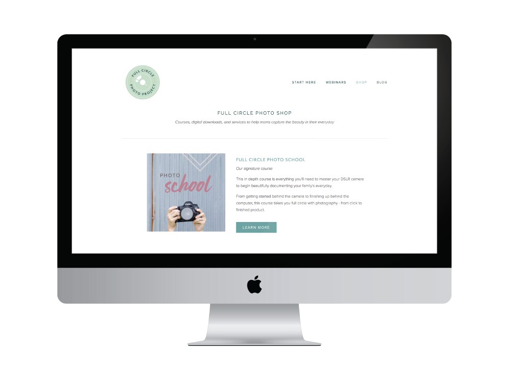
Step 4: Collateral items
Once all of the visual elements were finalized, I had the fun task of putting them all together by designing Brittany’s collateral items.
Along with the custom icon set, these items included blog post and social media image templates...
...slides...

...and a customizable PDF template that Brittany can use for her course and content upgrades (don’t mind that cupcake lorem ipsum text!).

Step 5: Squarespace website
The last step of the design process was Brittany’s new Squarespace site.
Because the Full Circle logo is a perfect circle, I chose a template whose layout has the logo and navigation side-by-side to take up less real estate on each page.
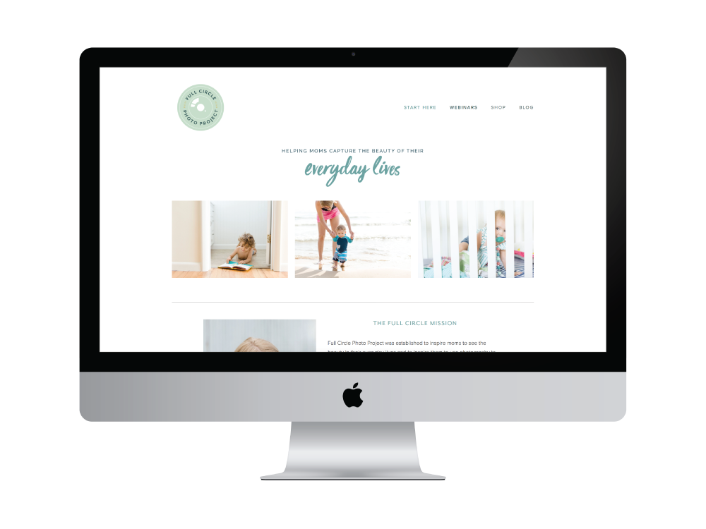
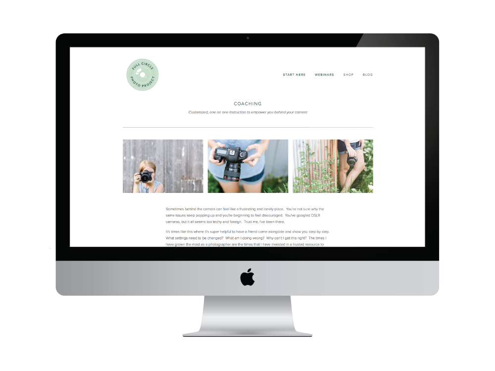
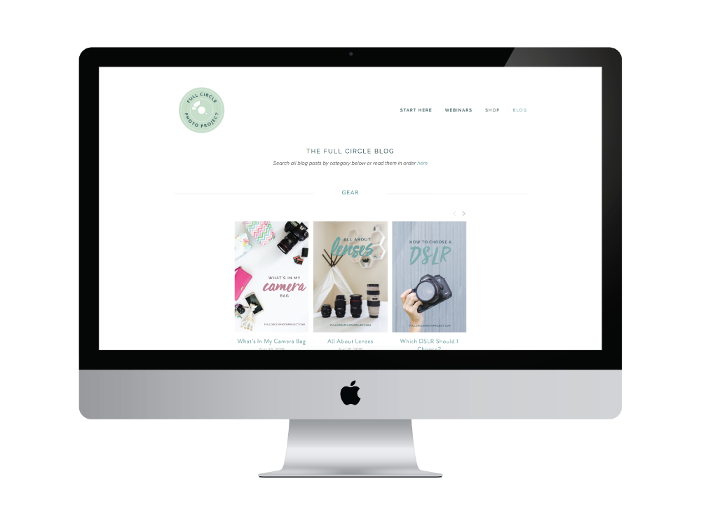
And since photography is the main emphasis of the entire brand, we wanted to showcase Brittany’s beautiful photos on every page. The 3-image borders - included on most of the interior pages of the site - were a great way to highlight the photos and help break up sections of content across the site, too.
I’m thrilled with how this new brand turned out and I loved working with Brittany. I would love to hear your thoughts on it, too!
What do you think of the new brand and website for Full Circle Photo Project?