Back-to-back weeks of client launches? It's like Christmas around here!
My 2-week client process has been keeping me busy, and I'm excited to not only give you a look at the finished brand and website for one of my latest clients, Reveleigh & Co., but also share a behind-the-scenes look (and a video) at how I created it.

Jessica Albers contacted me months ago about a new venture for her calligraphy business. She was giving it a little overhaul with a new name, new goals, and with my help, a new look.
I knew from the start that this project would be different from projects I've done in the past, which always builds my anticipation to get started. And my excitement about Jessica's project only grew once I saw the aesthetic of her secret Pinterest board. The photos she gathered together for inspiration were soft, golden, dark, and romantic, which fit in perfectly with the adjectives she used to describe Reveleigh and Co. in her client homework:
"...enchanting, graceful, whimsical, romantic, rustic, simple, sophisticated, incandescent, resplendent, timeless."
The first day of my design process for Reveleigh, I used those photos to build an inspiration board (and I thought it would be fun to show you a behind-the-scenes look at the making of it).
The inspiration board acts as a starting point for the project, and I keep it beside my artboard in Adobe Illustrator as I create the logo, collateral items, and website. It gives me ideas for patterns and illustrations, color, type, and texture, and I often place drafts beside it to make sure the aesthetic of my client's new brand matches the aesthetic of the inspiration board.

On days 2 and 3, I spent time sketching logo concepts and digitizing them in Illustrator.


I try to come up with 3 distinct logo concepts for my clients to give them variety, and I ask them for thorough feedback on each one to find out what they like and perhaps dislike about them. I like to find out their first impressions before I give my opinion on which concept I think is the best fit; I never want to sway my clients or talk them into a concept they aren't a fan of. Once they give me their initial reactions, I explain the design decisions behind each concept, talk through the options with them, and make any revisions necessary.

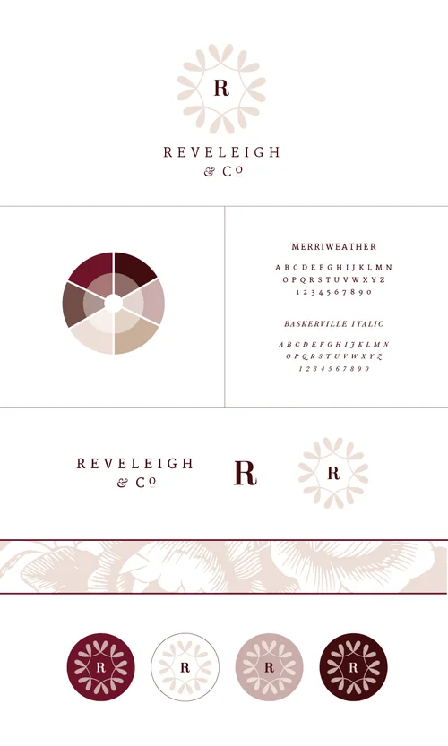
I was excited when Jessica chose option 1 (my personal favorite). It was the strongest, most memorable mark of the 3 because it provided us with several elements to pull from: the "wreath," the stylized R in the middle, and the wordmark underneath.


All 3 components of this logo can be broken apart to use as alternative logos. This gives Jessica more versatility within her brand, and it also made it easier on my end when I went to design the collateral material for Reveleigh and Co. (which are some of my favorite collateral items to date).
I pulled from the new color palette, font families, and illustrations in Reveleigh & Co.'s brand style board to create business cards...

...stickers...


...thank you cards...

...postcards...

...and a pricing guide.

This brand was a joy to design because it worked well as a system; the colors worked well together and created some beautiful color combinations (like those stickers!), the simple lines worked well with the classic typefaces and the floral illustration, and Reveleigh & Co.'s new logo fit in a perfect circle which made it ideal for stamps, stickers, and profile pictures.
Once the brand and collateral items were designed, I got to work on Jessica's new Squarespace site.
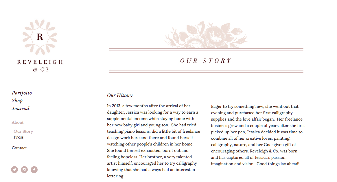
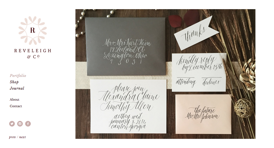
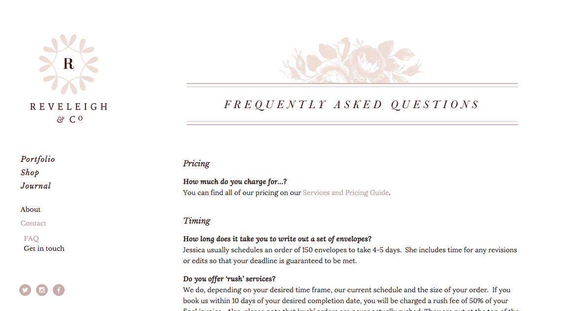
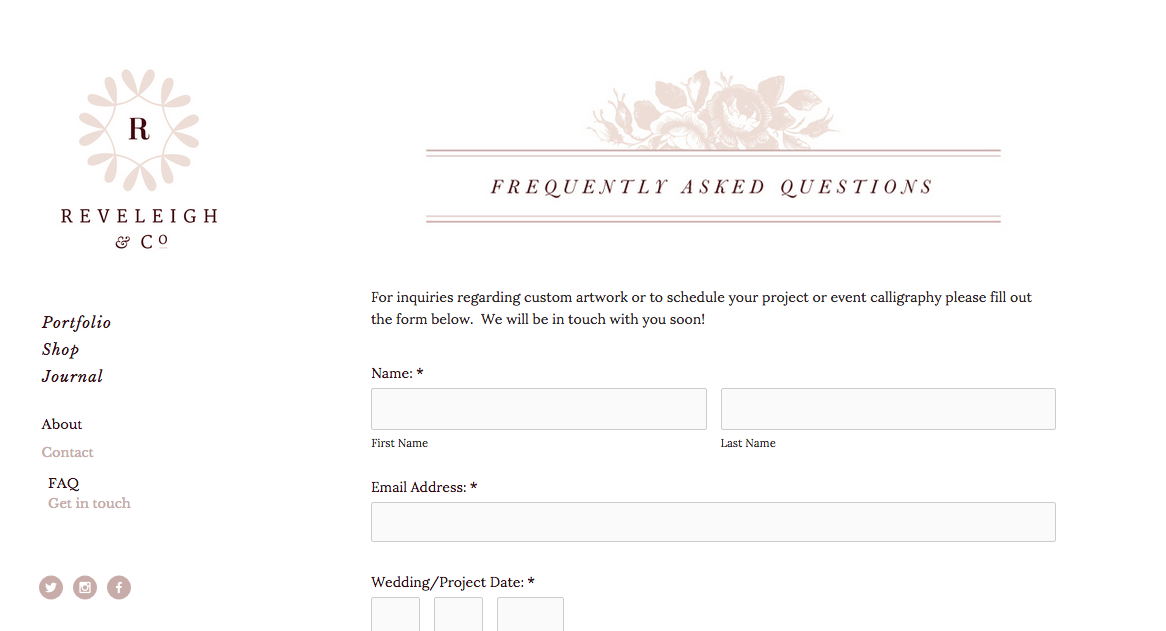
Because the new logo had a vertical layout, a run-of-the-mill website with the logo at the top created would have created a lot of wasted space above the fold of Jessica's new site, so we switched things up a bit with a side navigation. See it in action here >>
I'm thrilled with the outcome of the new brand and website, and even more thrilled that Jessica is happy with the outcome, too.
There's so much work that goes into projects on my client's end, too, so be sure to visit Jessica's website, view her work, and leave her a note on the new Reveleigh & Co. blog.
What do you think of the new brand and website for Reveleigh and Co.?