Joy. It's the one word that I was asked to reflect in the new brand and website for Bulloss Photography and it perfectly captures my experience working with Jess and Will. From our initial design meeting to the photos that were used in the inspiration board and the excited emails that I received yesterday about today's launch, joy has been the common theme throughout this design project. This new brand and website is one that I'm thrilled to add to my portfolio, and I'm excited to walk you through my process and reveal all of the lovely details today.
When Jess first contacted me about a redesign, she was looking for an original brand and website that had personality. She used words like charming, light, joyful, hospitable flirty, and fun to describe her wedding photography business and ideal brand, and she didn't feel that her current brand was measuring up. Jess also wanted to appeal to her ideal client, a 20-30 year-old bride-to-be with a sweet, bubbly, down-to-earth personality; someone who not only wants beautiful images, but an unforgettable experience.
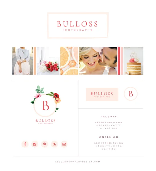
So I kept those keywords and that ideal bride in mind as I pulled together images for the Bulloss Photography inspiration board. I chose photos that reflected joy and femininity, I stuck with a color palette that was fresh and flirty with peachy orange, soft blush, and vibrant pink, and I put an emphasis on white space to achieve that charming, light tone.
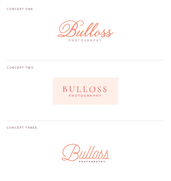
From there, I came up with 3 separate logo concepts. The first was the classiest, with a fancy script font. I was drawn to the B and thought it had the potential to be used on it's own as an alternative logo, but it wasn't one-of-a-kind. The second logo was the simplest, and I knew that I would need to bring in stronger brand elements if we went with this option. This one was my favorite because it had the most potential. The third option was a little more retro and unexpected, but it didn't feel like a brand in the wedding industry. Nonetheless, it had the fun, personable characteristics that Jess had been looking for.
We both agreed on Concept 2. Jess had asked for a floral pattern at the start of the project, and I agreed that it could bring a colorful feminine touch to the brand. After hours of trying to come up with the perfect hand-drawn pattern, I had the idea to incorporate the floral illustrations into the logo itself as a "floral crown" of sorts. The more flowers and leaves I added, the more original and almost 3-dimensional the logo became. I was a little nervous in showing Jess the concept because it was very different than what she had been expecting, but her reaction couldn't have been better. She loved it! Those strong brand elements are just what the original logo needed.
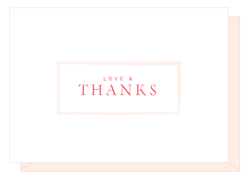
Once we had the logo and the brand style board in place, the collateral items and website were a blast to design! Here's a peek at the new business cards, thank you notes, and Facebook page designs:
And photos don't do the new Bulloss Photography website justice. Head on over there to see it for yourself!
At the end of the "homework" that Jess and Will completed before the 2-week design process began, I asked them which aspects of their business they wanted to highlight and emphasize the most. "We exist to spread joy. Capturing photos helps us do that, but before all else we want to be making a difference in peoples' lives by spreading joy in all that we do."
When I look at the past 2 weeks and the final product, I see joy through the cheerful colors, simple typefaces, floral illustrations, and gorgeous photos. I loved working with Jess and Will and I'm thrilled with the outcome of their new brand and website!
Are you interested in working with me for the design of your brand and website? Visit my Services page for more information on my process, design package, pricing, and availability, my Portfolio for a look at my most recent work, and my Contact page to get in touch!

