Taking on one design client at a time for 2015 has had numerous benefits, but I've been surprised at how much this new process has helped my creativity. Being able to pour into one client for 2 weeks helps me give them my undivided attention, dive into the new brand's aesthetic, and provide them with a cohesive visual identity through logos, collateral items, and a website. Each 2-week project is different, and the variety and challenge to make each brand one-of-a-kind has been fun for me.
I've had several photographers in my project lineup for the first few months of this year, so I challenged myself to go above and beyond to ensure that each of these brands would be individually unique. The newest Elle & Company brand and website design project is unlike any other I've worked on, and I'm excited to show you some peeks and walk you through the design process today!
Akamie, the creative lady behind the lens for Ali Mac Photography, was in search of a fresh new visual identity for her photography business when she contacted me last fall. Her previous logo was a little too modern for her taste and lacked appeal for her ideal audience: brides and high school seniors. She asked me for a unique brand that reflected elegance, whimsy, luxury, bliss, style, and class.
On Day One of the project, I pulled together an inspiration board as my starting point for the design of the brand. I noticed a couple trends in Akamie's Pinterest board that I tried to reflect in the inspiration board. First, I noticed geometry. Diamonds, rectangles, chevron patterns, and clean lines were subtly noted in the photos she added to the board. Second, I picked up on the neutral, soft color palette of gray, lavender, beige, and metallics. As I began to pull items from her Pinterest board and refine the color scheme, I saw the contrast of the modern geometric shapes with the soft colors and textures and it fit together so nicely. The unique color scheme would appeal to those glamorous brides Akamie wants to work with, and the slightly modern patterns would appeal to those high school seniors, too. I was onto something!
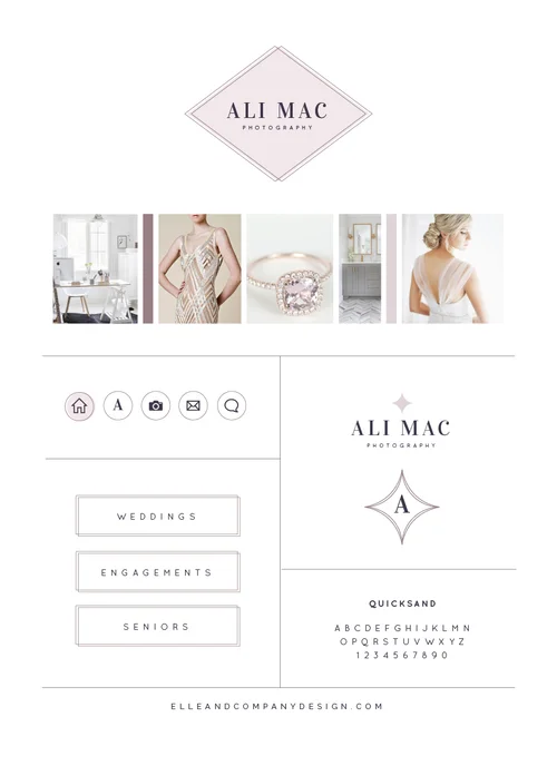
Once I received approval on the inspiration board, I spent the next three days working on the primary logo and alternate logos. I chose a simple, timeless typeface for the wordmark and used a rich, dark purple for the type color. I pulled in the geometry of the inspiration board through the diamond shape and the thin double border, and the lilac background pulled in some softness. Because purple is a color of royalty and elegance, the color scheme of the logo fit in well with the aesthetic we were set out to achieve.
For the secondary logo, I used the same wordmark but removed the double border and the lilac background. To allude to the diamond shape of the primary logo, add in a touch of lilac, and reference glam and whimsy, I added a 'sparkle' shape above the lettering. I carried that same shape through to the letterform mark, brought back the double border, and simplified the logo to a single letter. All three logos give Akamie versatility within her brand and give her the flexibility to mix things up among collateral items.
Once the logos and brand elements were finalized, I spent Days 5 and 6 on the collateral items for Ali Mac Photography. Among the items were the business cards, letterhead, and social media designs pictured below.
Days 7 through 10 always seem to be my clients' favorite, when I take both my design work and their business portfolio and information and combine it all into a streamlined website. Here's a look at some of my favorite pages on the new Ali Mac Photography website:
The result of this design project resulted in a unique, elegant, whimsical brand and website that I'm thrilled to add to my portfolio. Head on over to the new Ali Mac Photography website to see more details of the latest Elle & Company client project, and visit the links below to see the most recent Elle & Company brand and website designs!

